

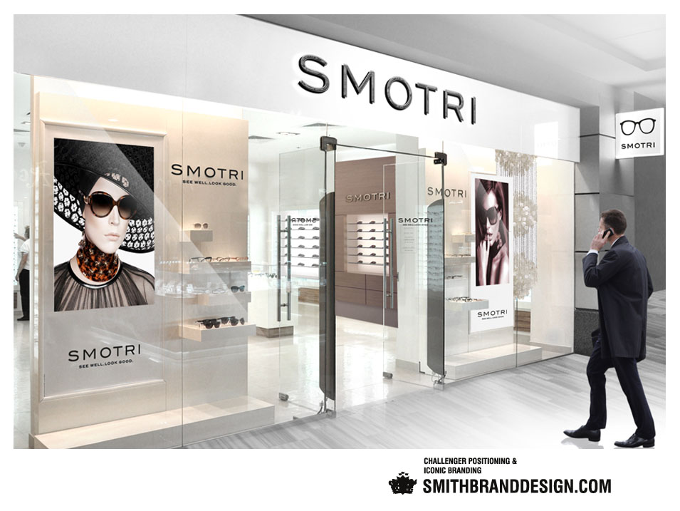


Task
Complete rebranding of Smotri to reaffirm its position as Russia’s choice retail brand for eyewear.
Scope
Creative strategy, brand architecture, naming, brand identity.
Solution
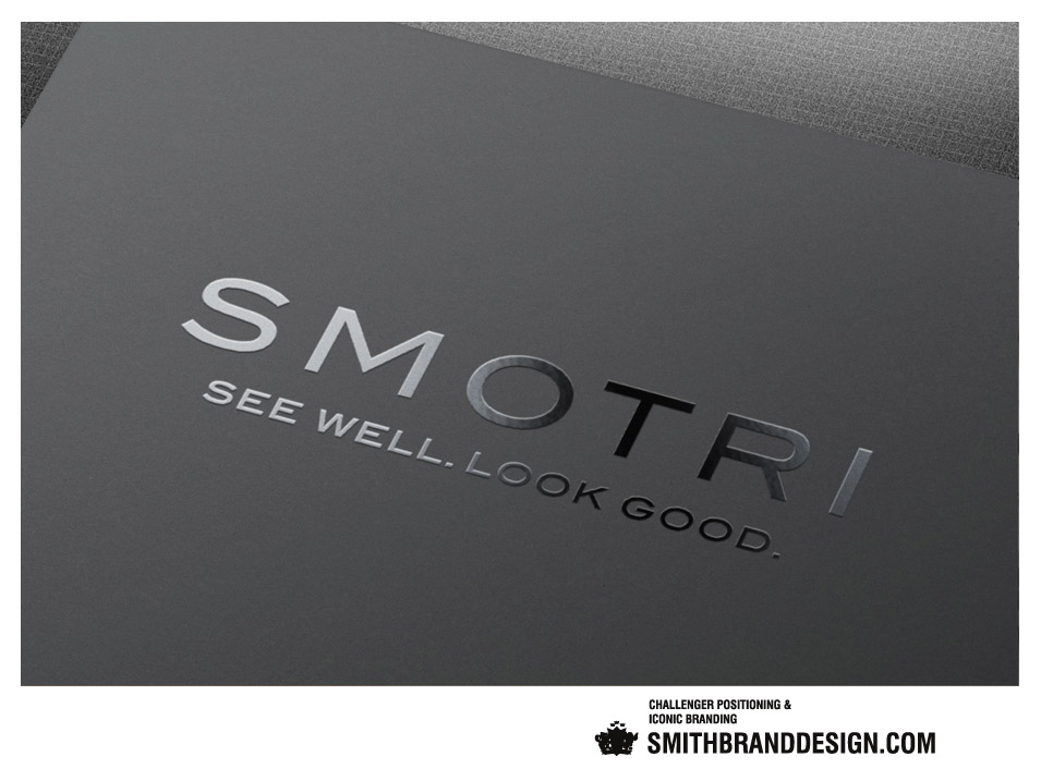
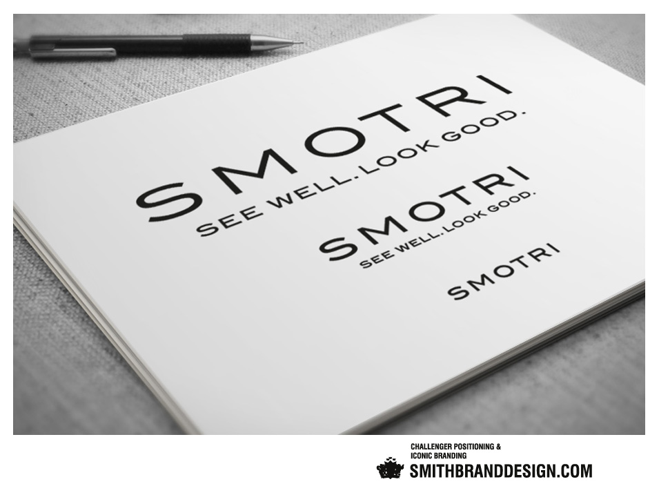
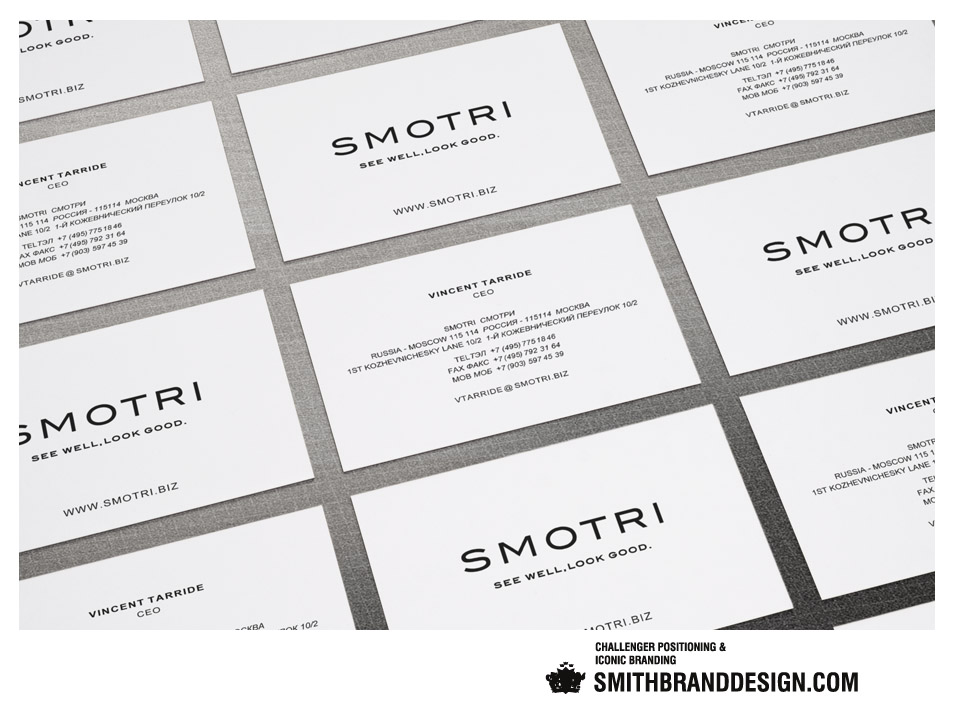
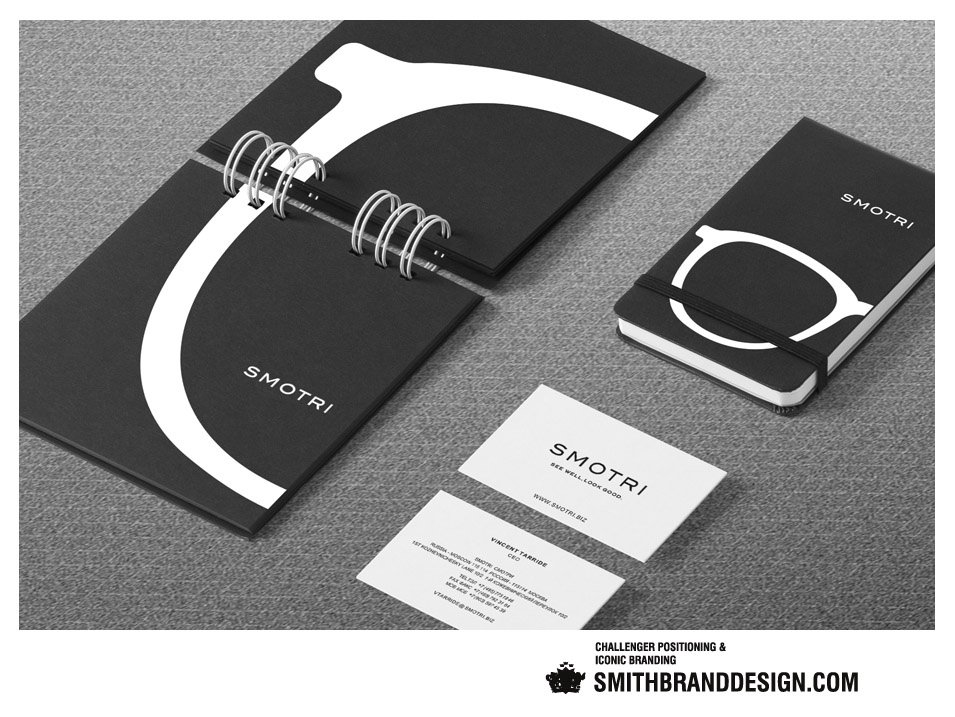
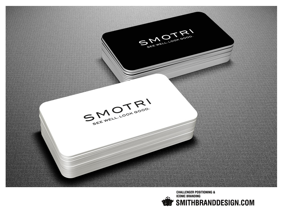
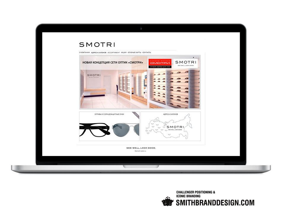
The custom designed logotype firmly positions Smotri as a legitimate icon and the phonetic translation of the Russian СМОТРИ which means ‘look’’, puts in evidence the fact that it‘s the premium russian retailer of international eyewear. The new identity design illustrates the company’s positioning as both the top retail brand for luxury optics as well as corrective eyewear with optometrists and opticians on site, and the claim “See well. Look good.” exemplifies this.
Note
The brand design was implemented and extended to include the flag ship store in Moscow and rolled out to include all of the brand’s stores in Moscow, St. Petersburg and over forty cities in Russia.