Acqua di Portofino, The Art of Restraint
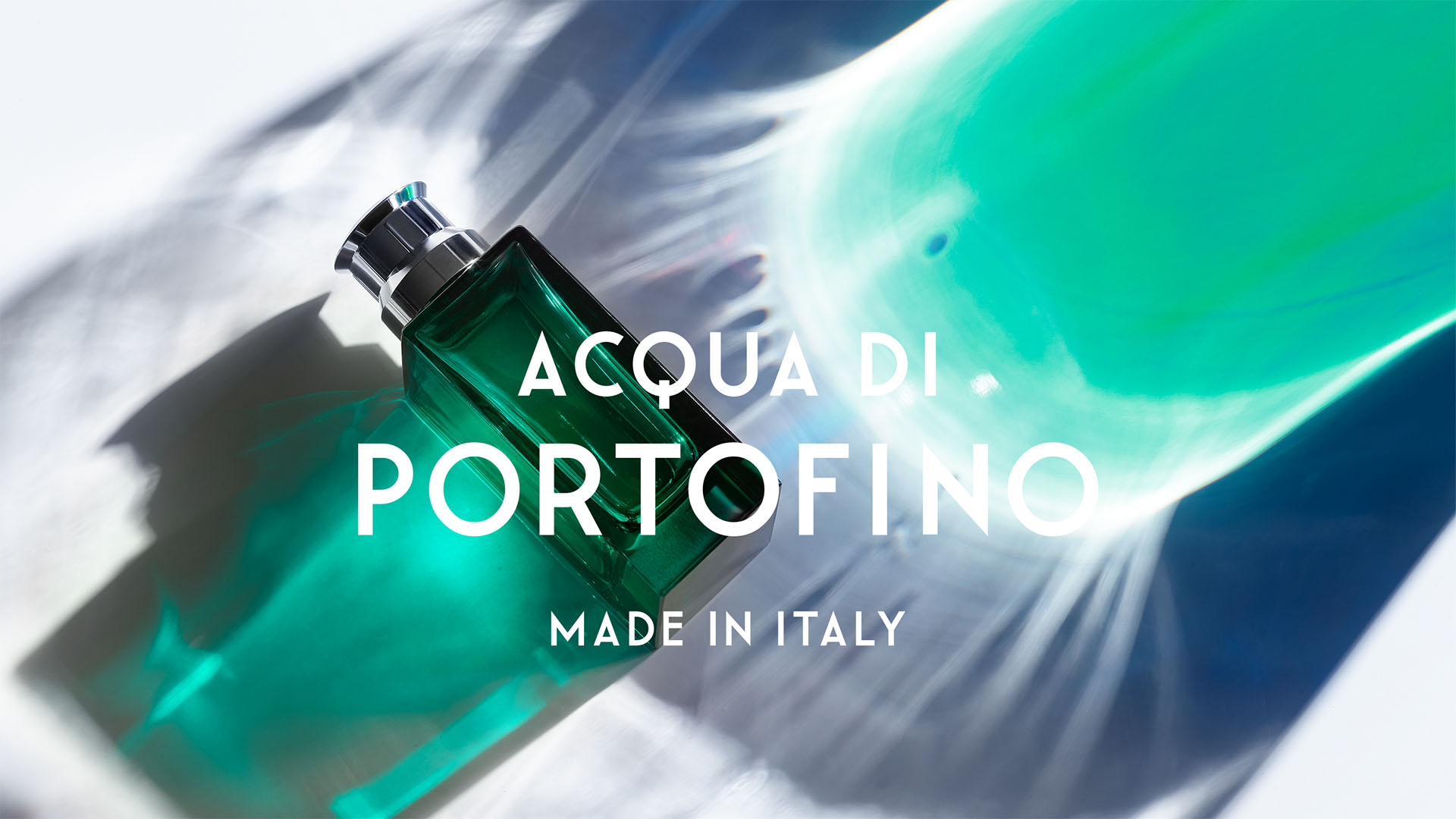
We embarked on a complete brand transformation with Acqua di Portofino, distilling the effortless character of this legendary Italian destination into a world of scent, image and tactile sophistication. Rooted in clarity, restraint and a distinctly contemporary point of view, the new expression captures Portofino’s quiet confidence without falling into nostalgia.

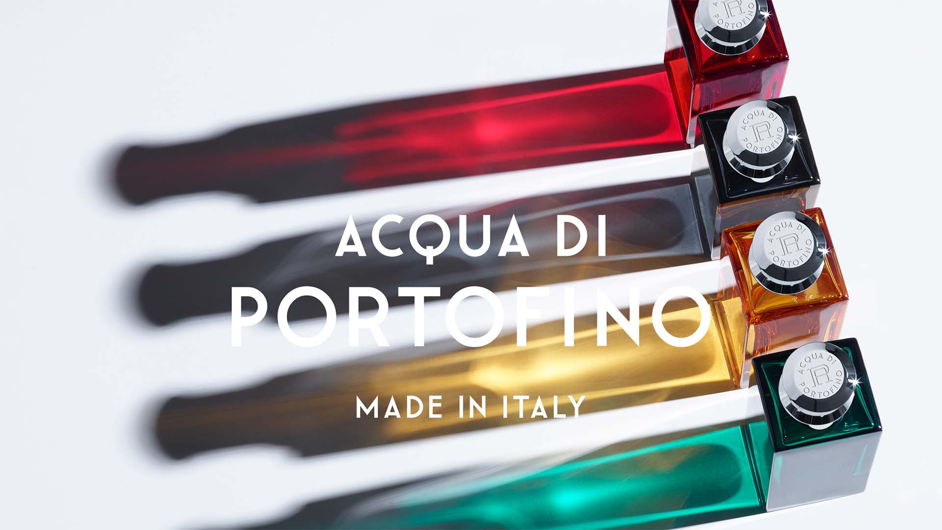
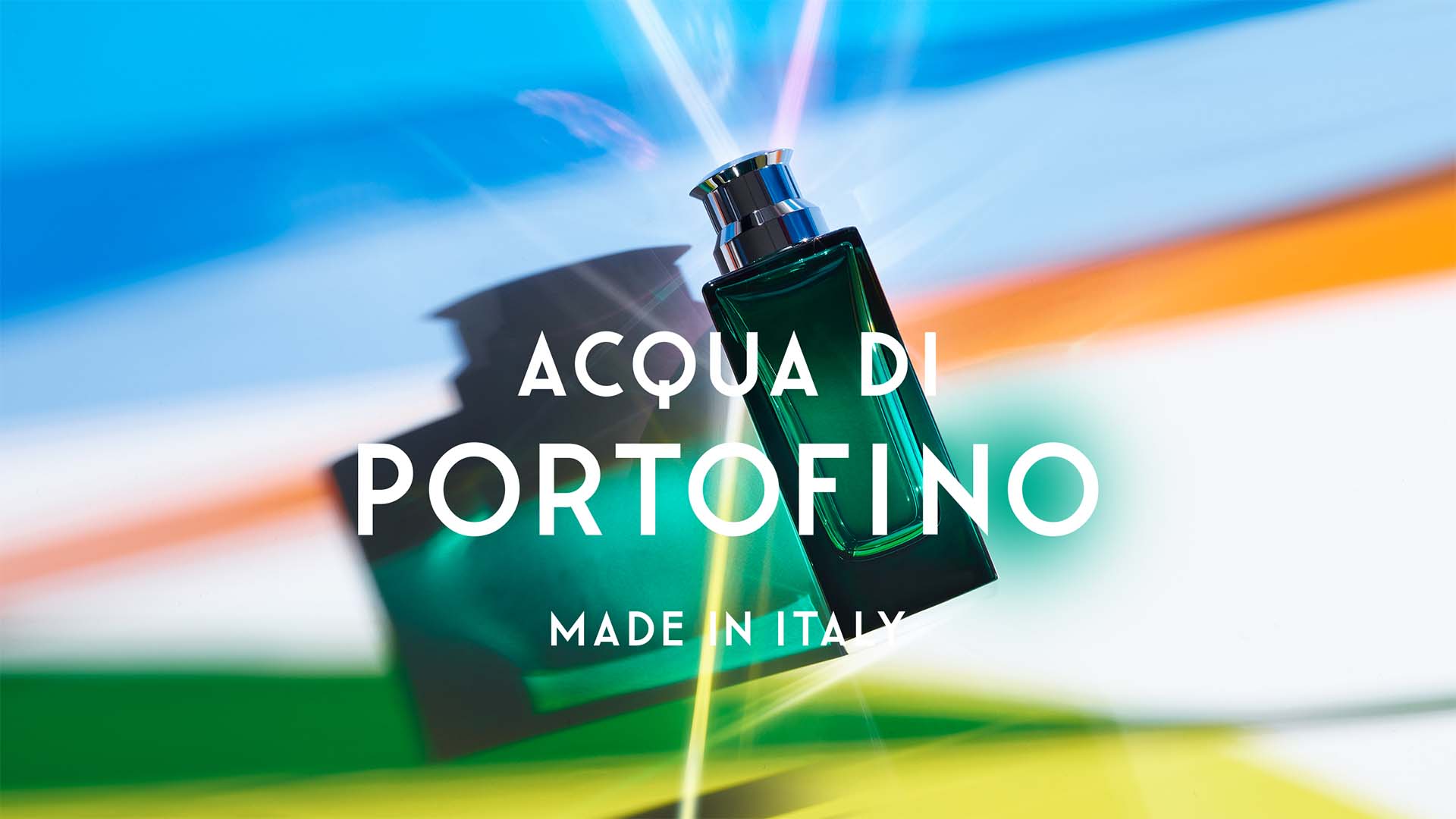
Drawing from the purity and contrasts of the Ligurian coast, we created a precise visual language where colour meets emptiness, tactile richness meets stark geometry, and distinctive cues cut through today’s visual noise. Heritage is present, but deliberately stripped back, giving the brand a sharper and more relevant identity.
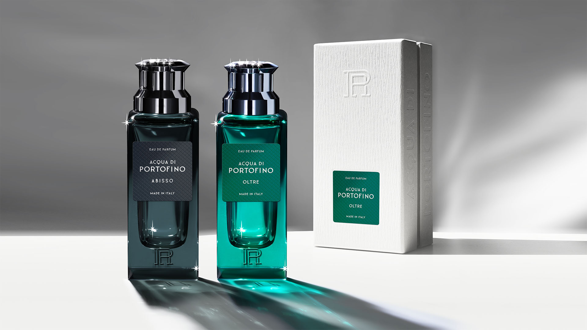
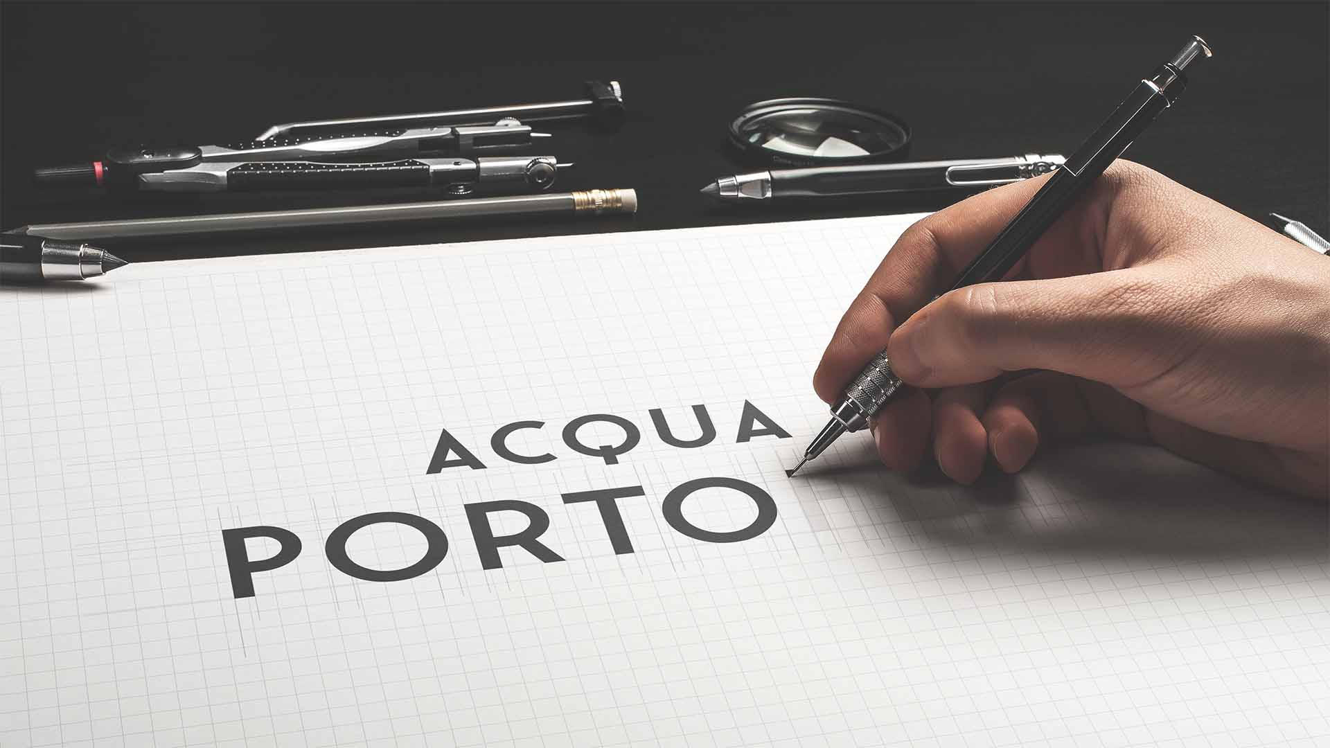
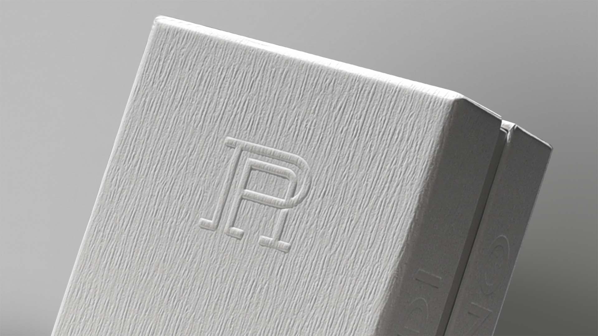
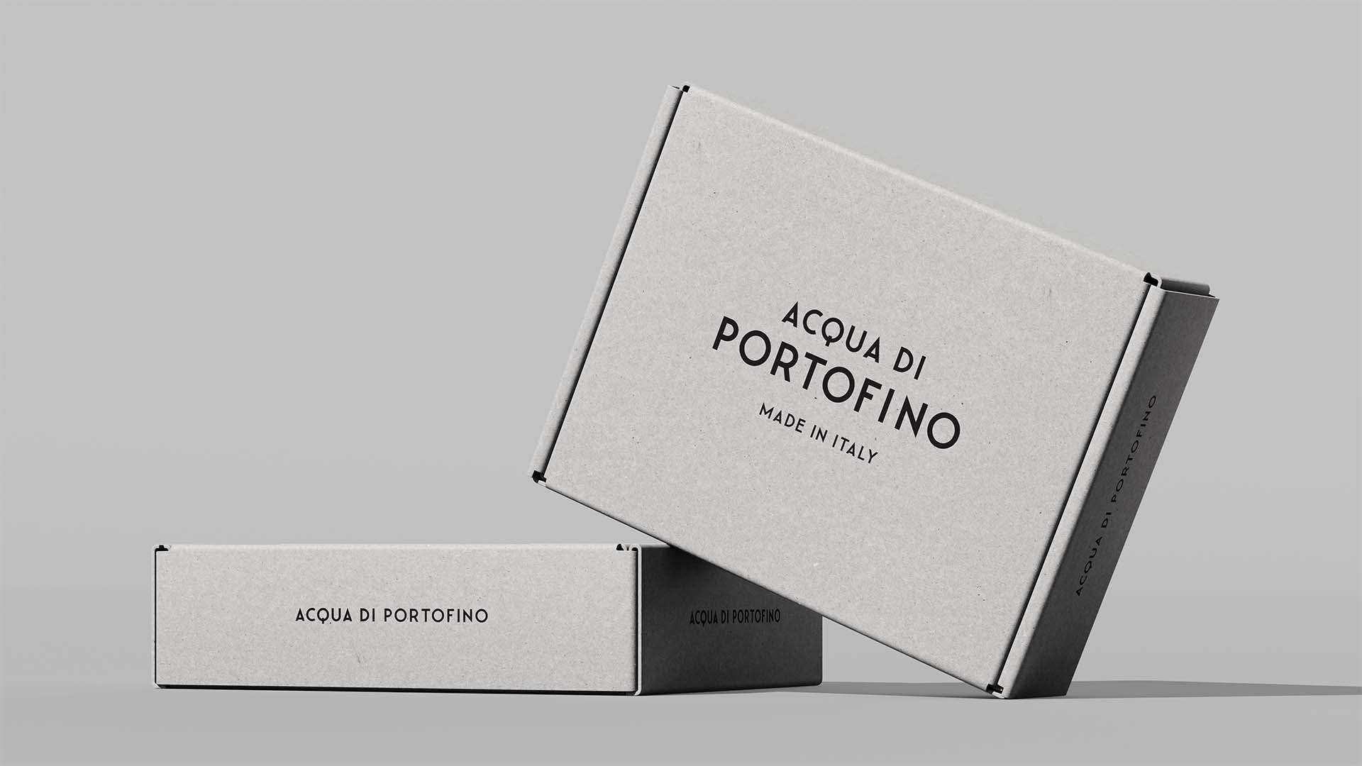
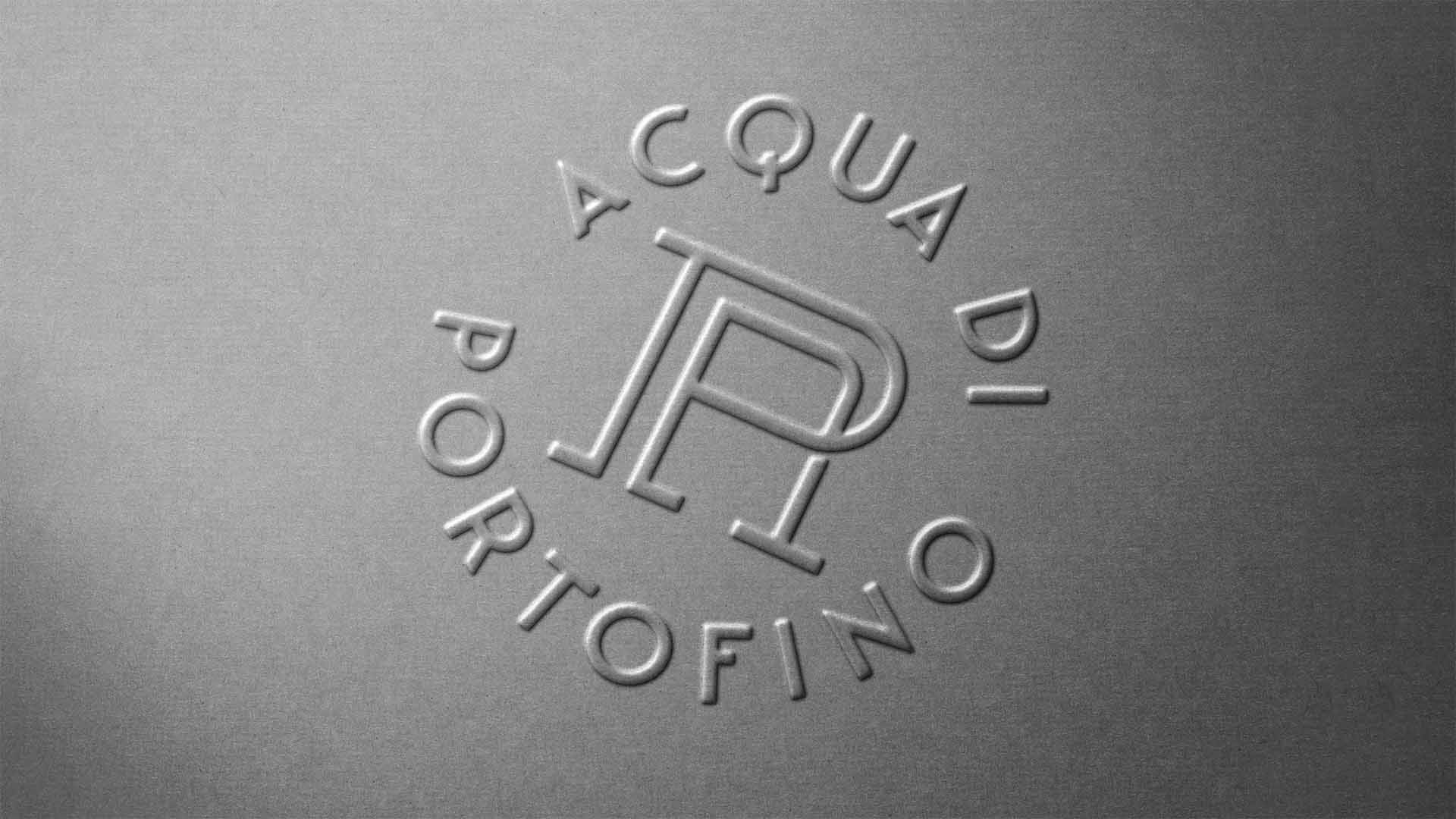
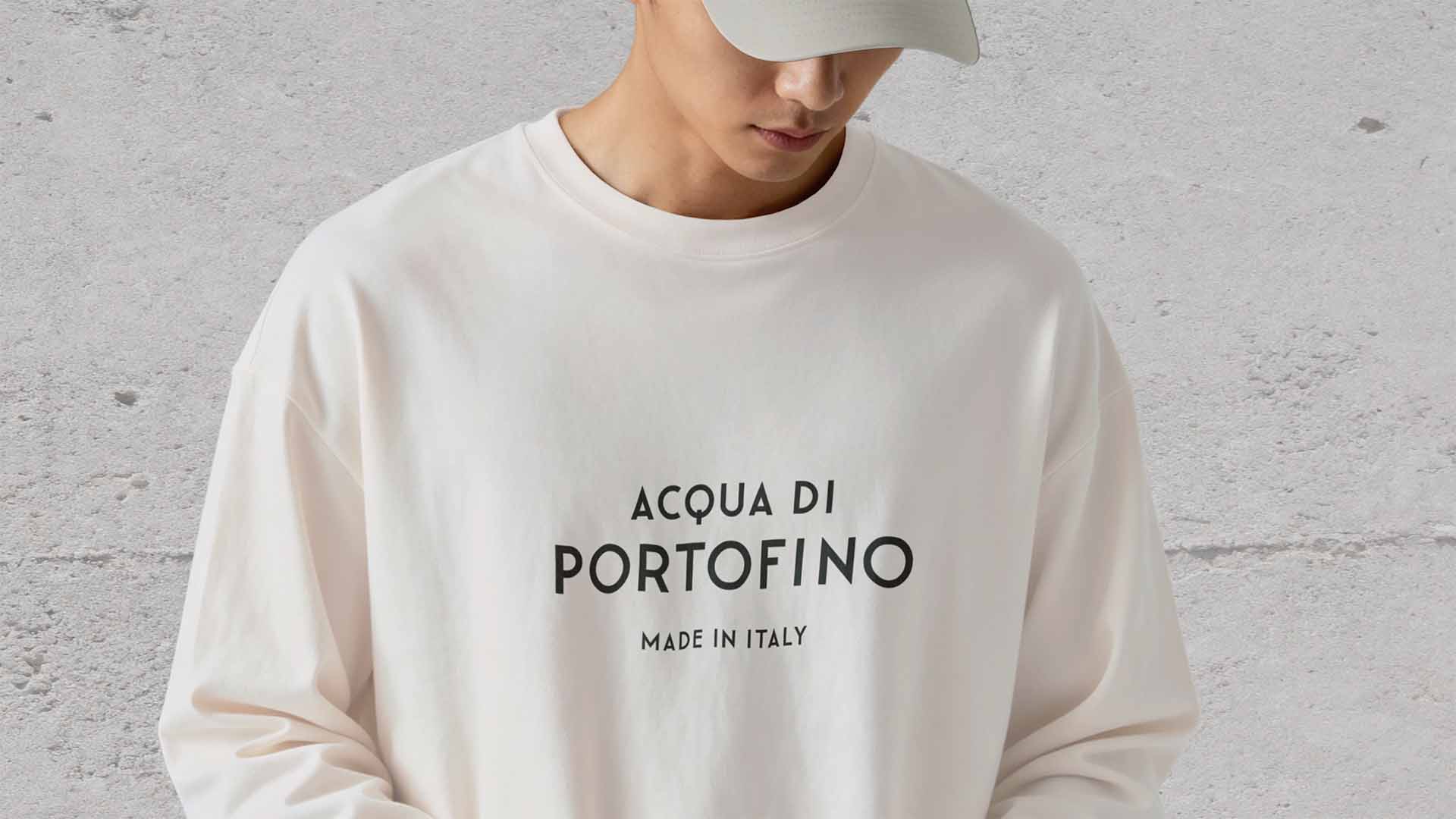
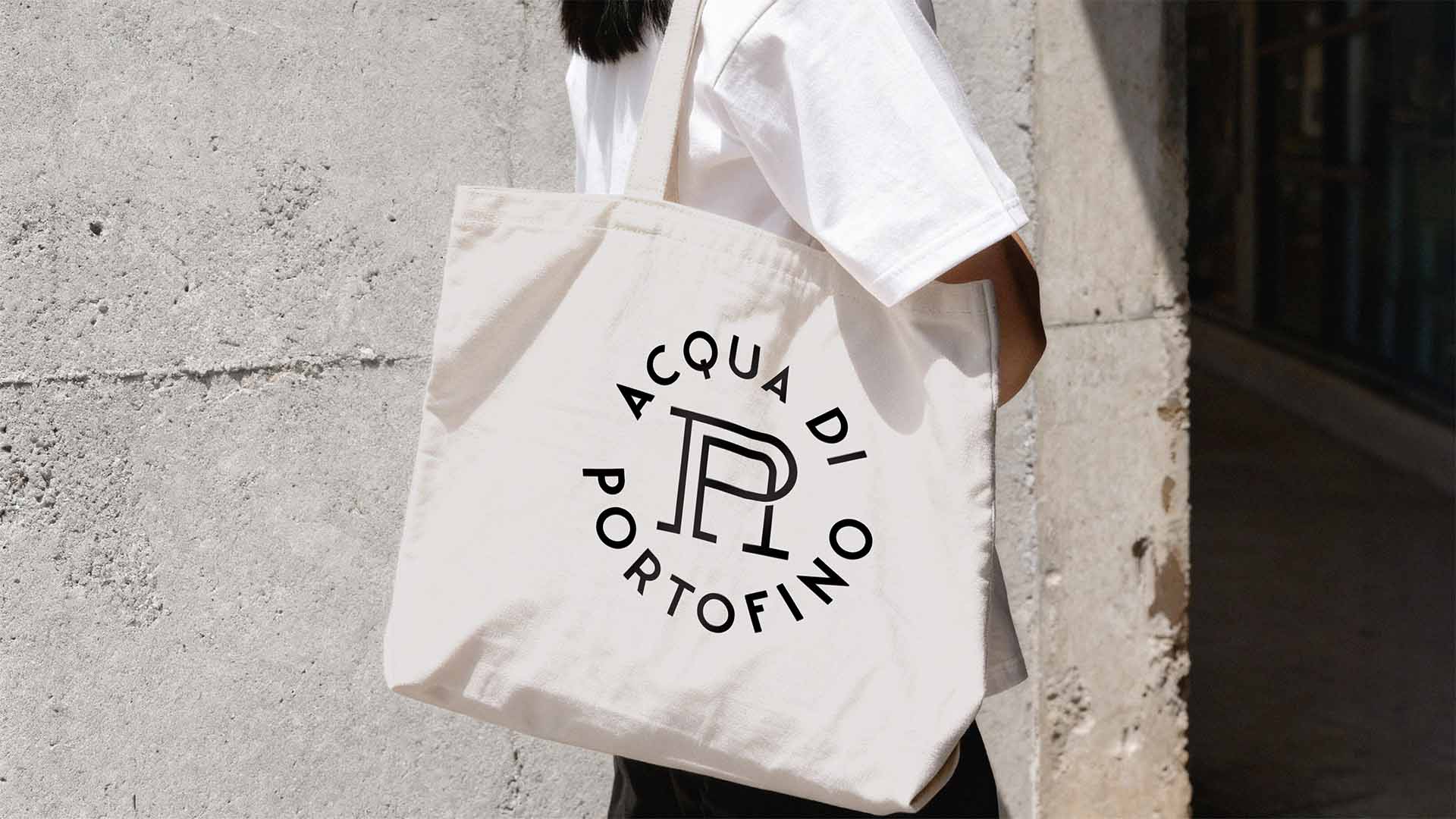
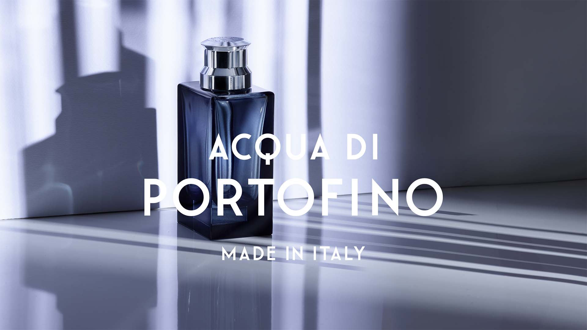
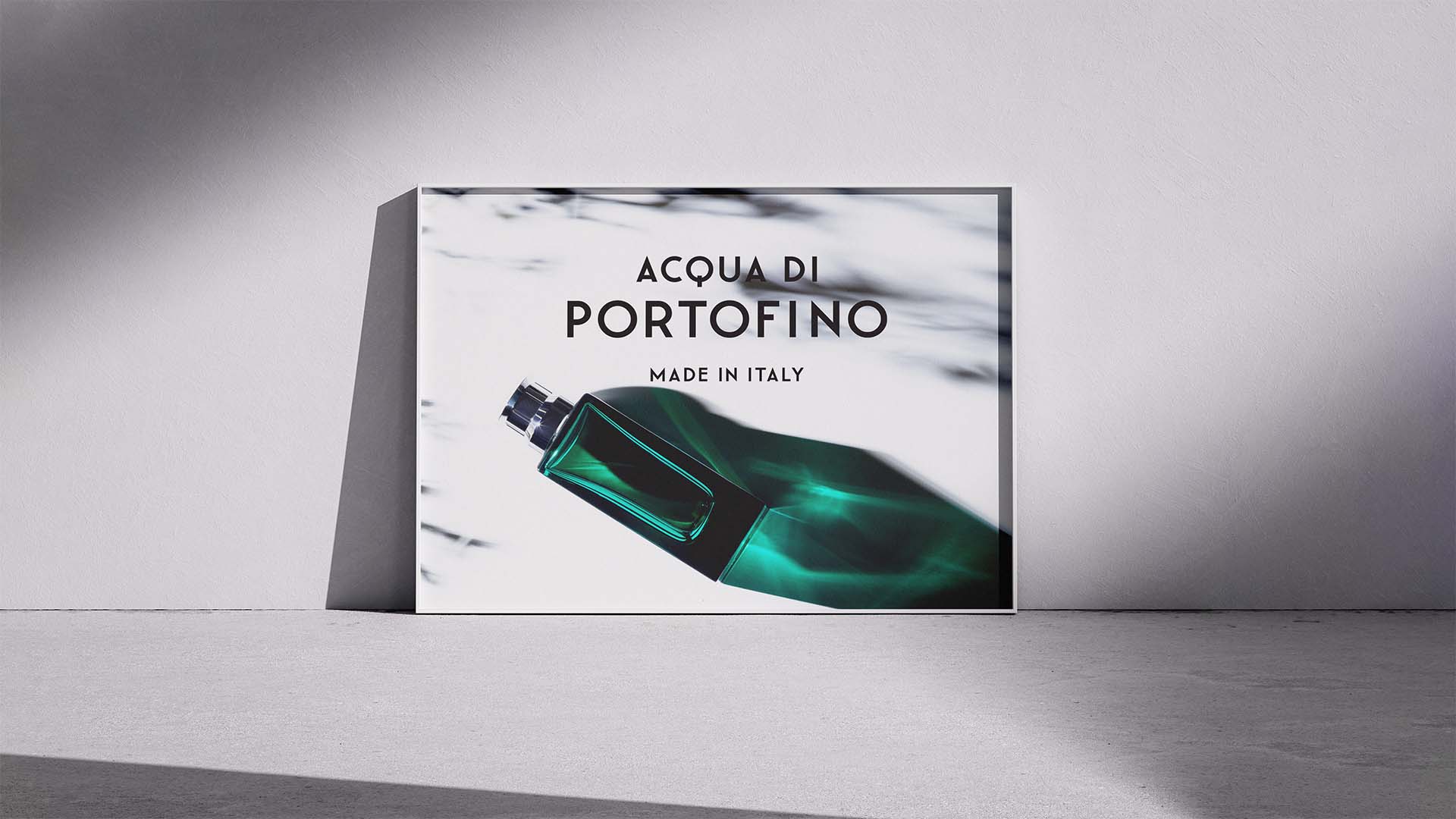
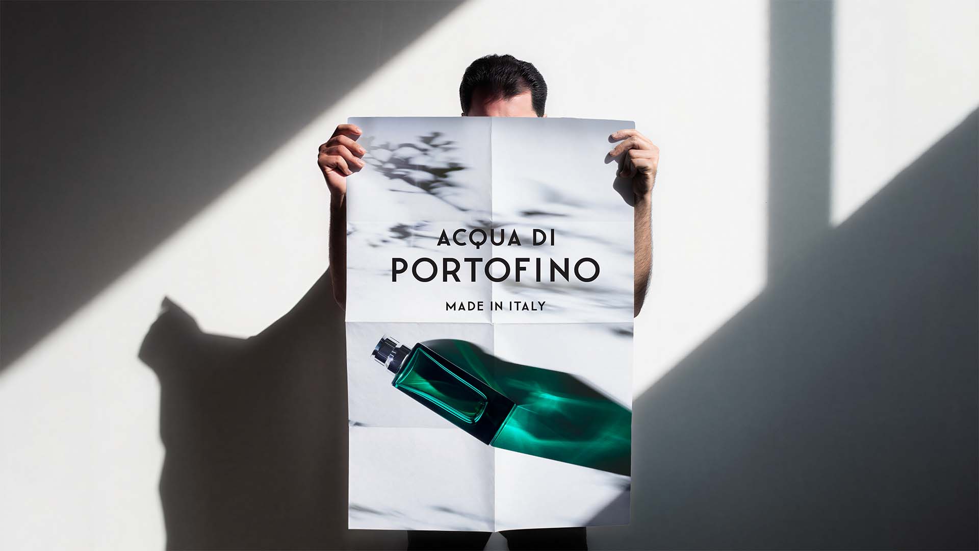
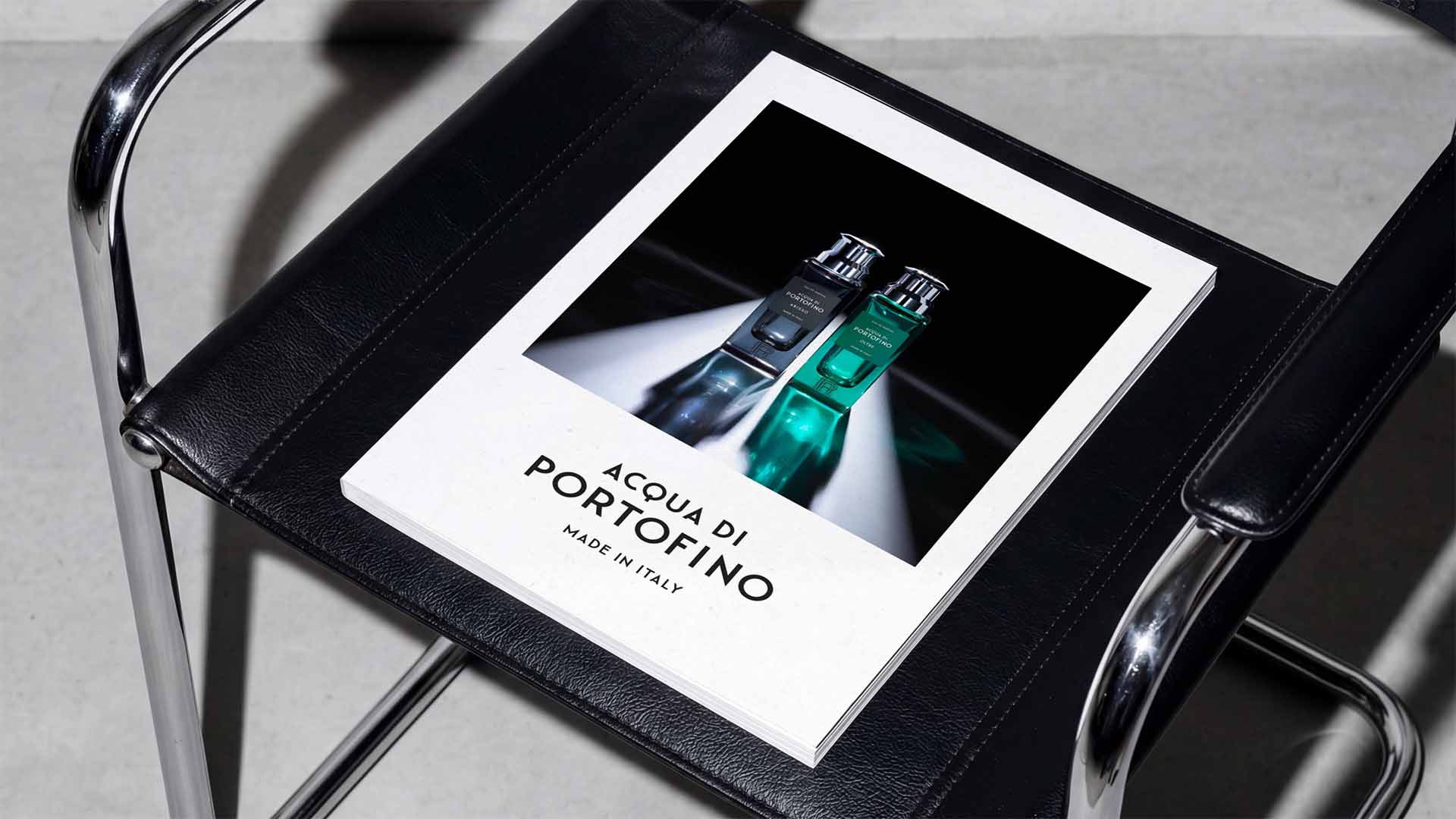
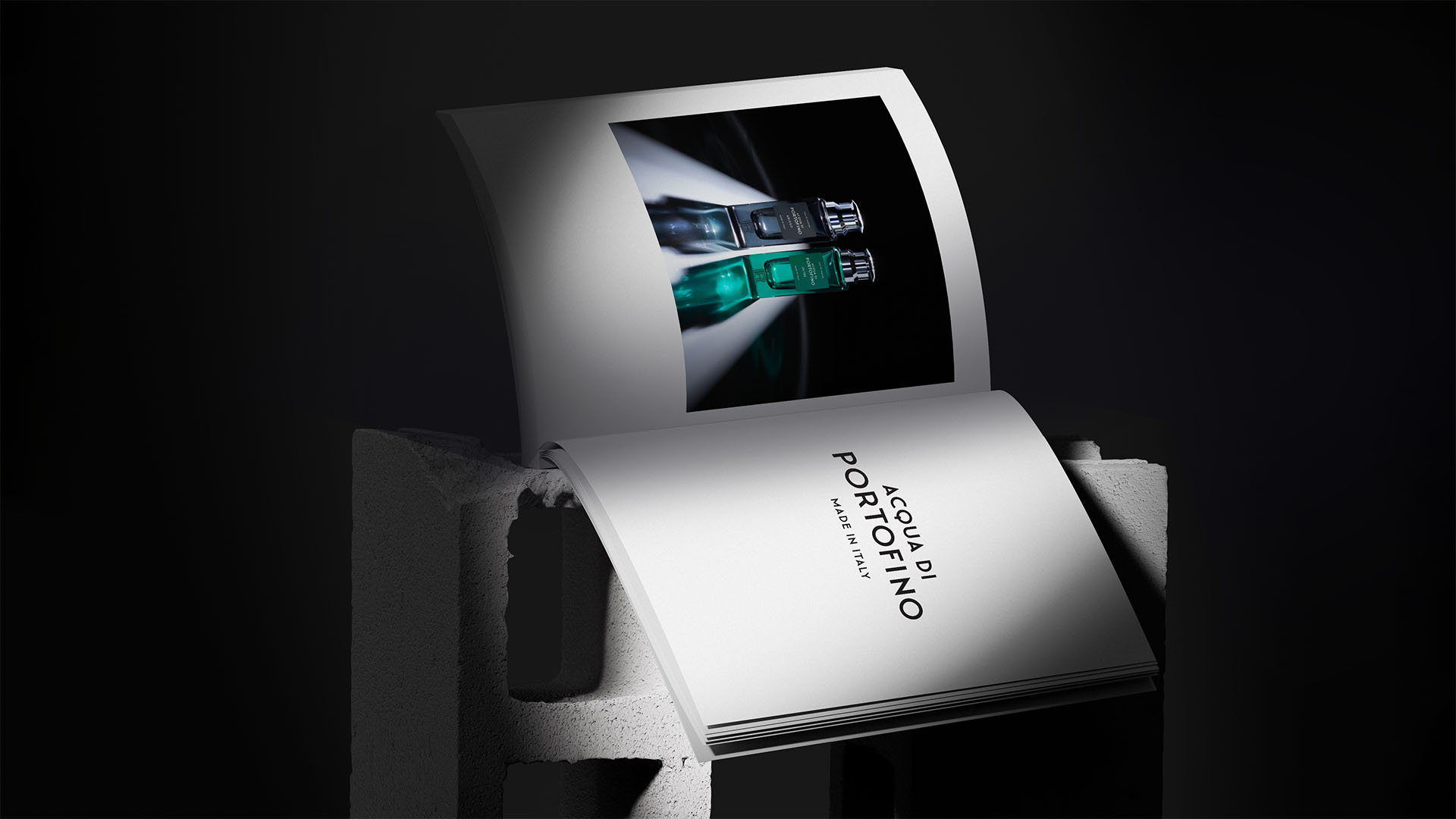
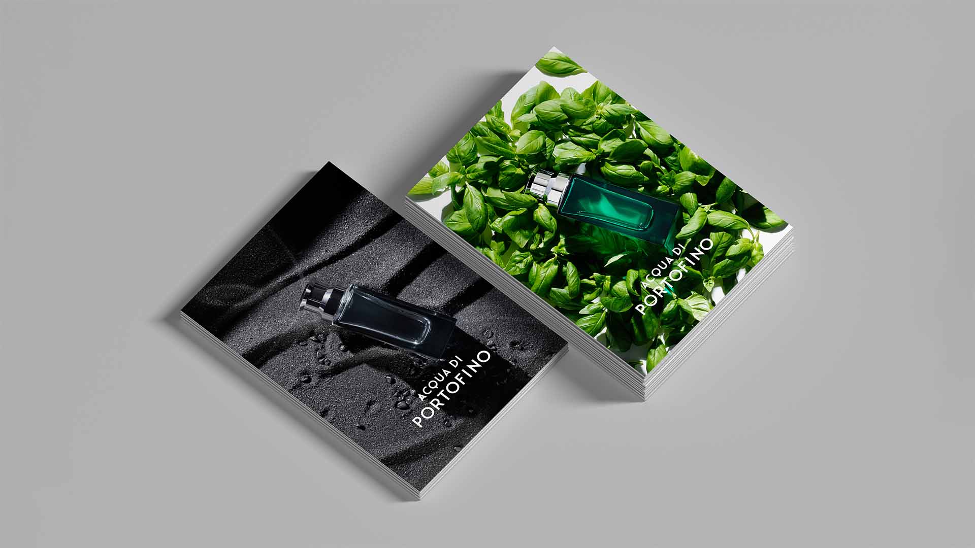
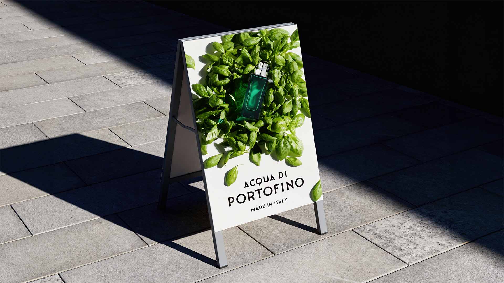
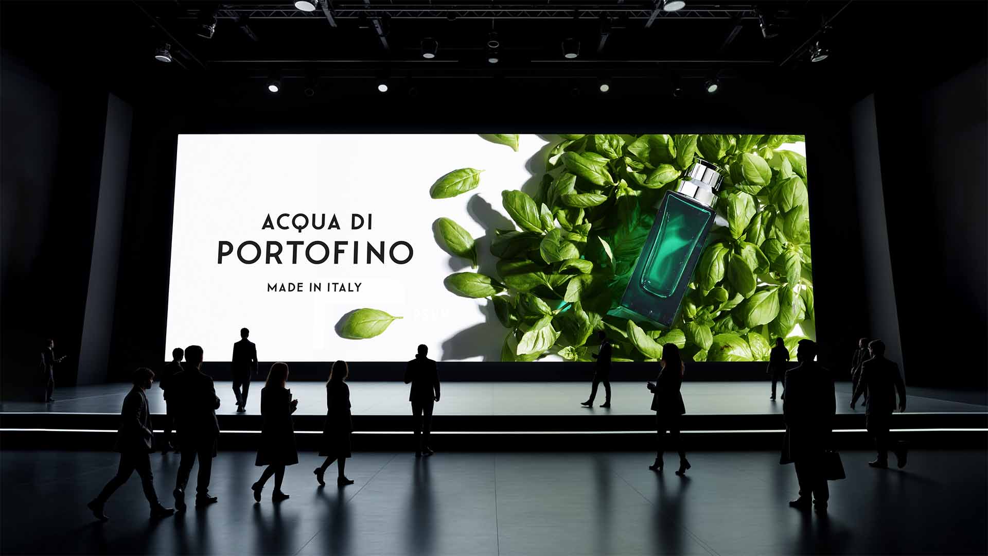
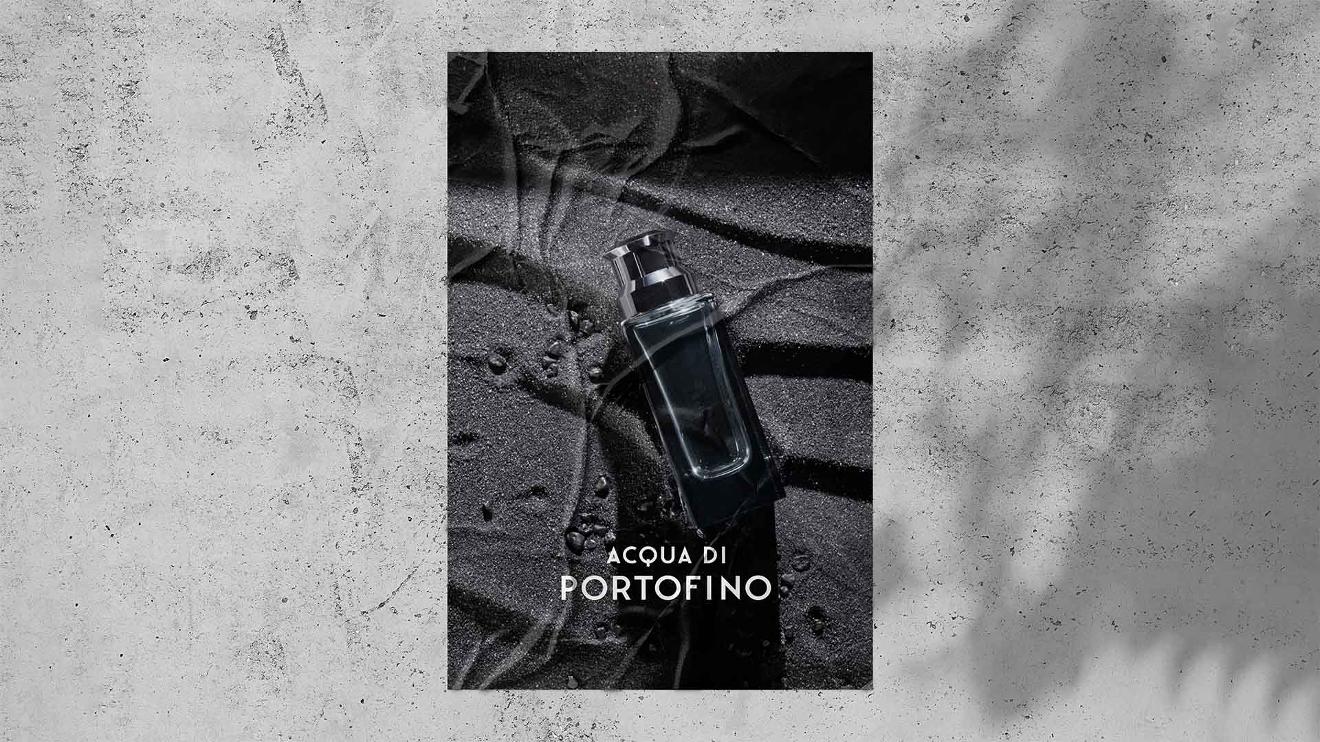
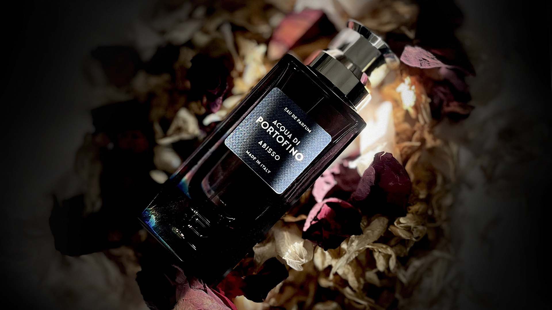
Unexpected olfactory compositions are expressed through stark glass bottles, measured sans-serif typography, Japanese paper and a distinctive monogram. A custom brand mark subtly recalls the heyday of Italian bath resorts, while documentary-style photography and sharp-lined communication extend the identity across packaging, campaign, digital and retail.
The resulting expression creates a confident and cohesive narrative, positioning Acqua di Portofino as a contemporary Italian fragrance brand. Free from excess, nostalgia and visual noise, it embraces a more considered idea of luxury — where restraint becomes the defining expression.
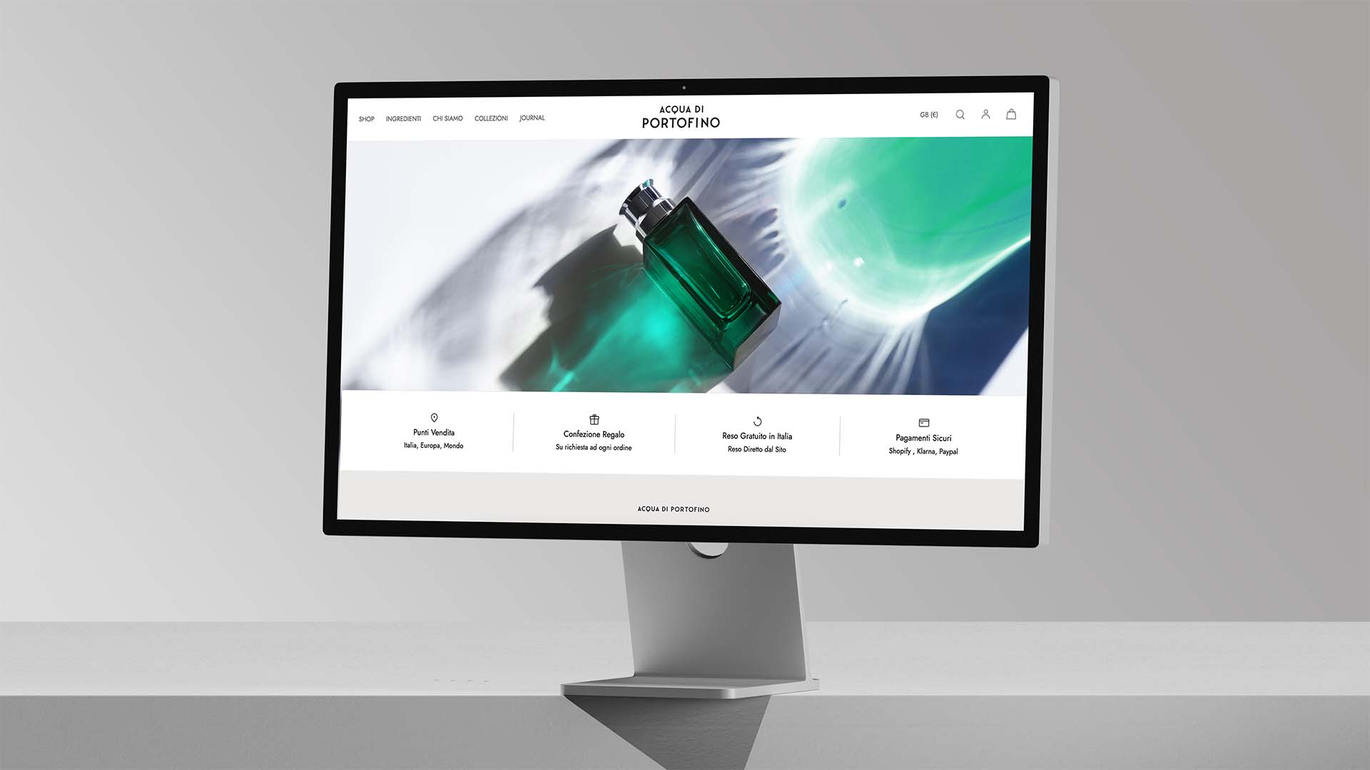
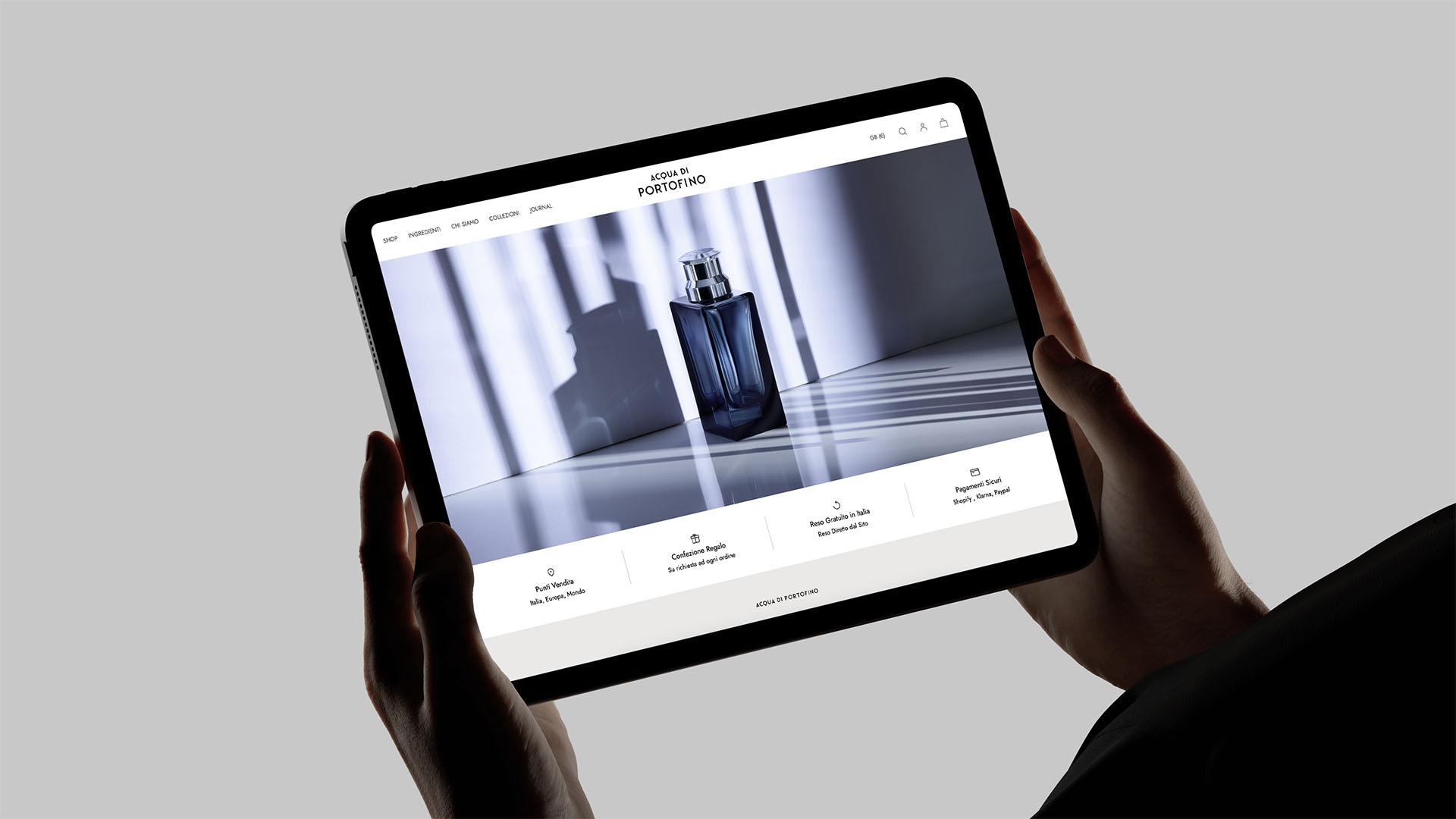
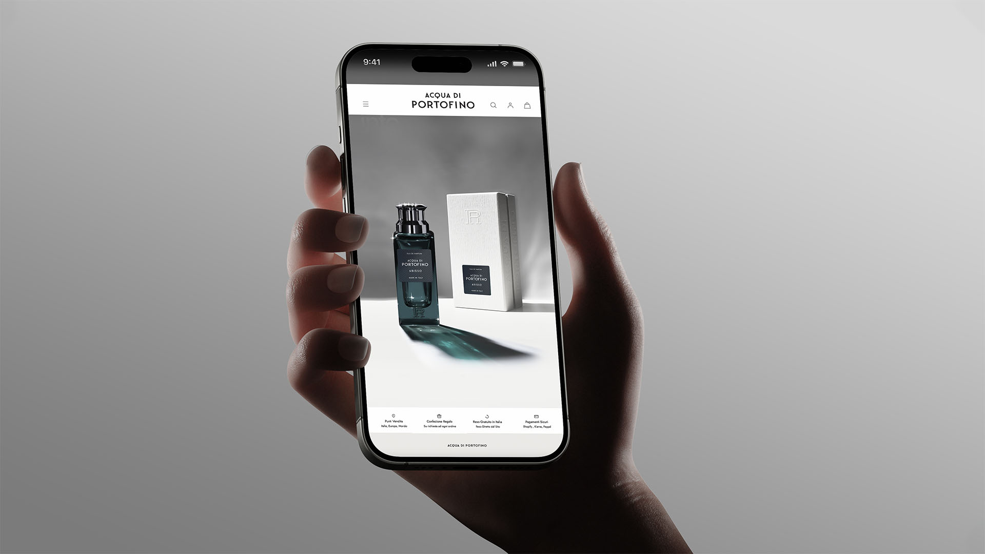
See our digital platform design acquadiportofino.com
Brand Strategy, Portfolio Strategy, Design Strategy, Communication Strategy, Copywriting, Naming & Storytelling, Logotype Design, Visual Identity, Packaging Design, Digital Design, Web Design, Photography & Image Creation, Exhibition Design, Advertising.




Thinking Ahead.
Fredrik is always thinking one step ahead. Before I’ve even finished a request, he’ll often have a sketch ready that captures the direction perfectly. It’s this intuitive way of working, combined with our shared creative vision, that makes our collaboration so valuable.
Adolfo Varini, CEO