Anna Kriss, eat right
We reimagined the Anna Kriss identity making it both an efficacious, desirable new brand and a leader in holistic nutritional care, challenging branding conventions in this sector.
We were entrusted with the opportunity to develop a distinctive corporate branding program for Anna Kriss, a premier nutritional coach based in Vienna. Anna is dedicated to empowering her clients to take charge of their health, fostering a structured and goal-oriented approach to their eating habits.
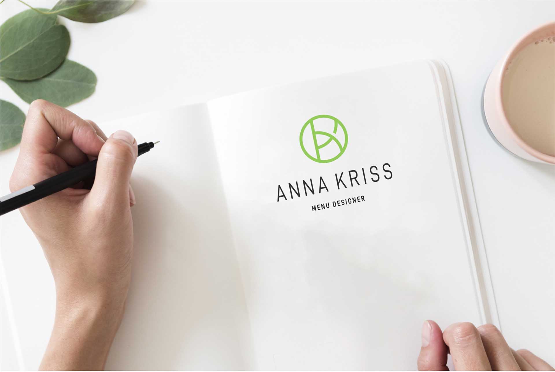
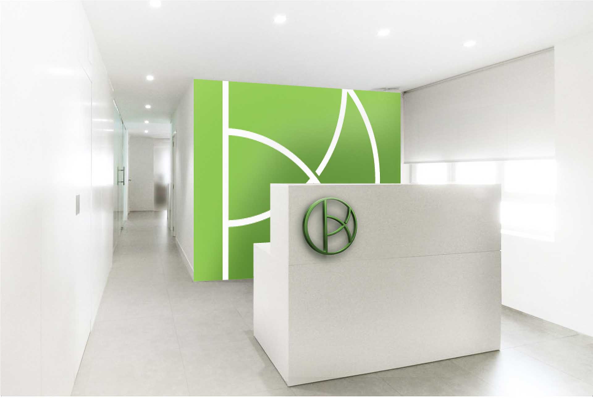
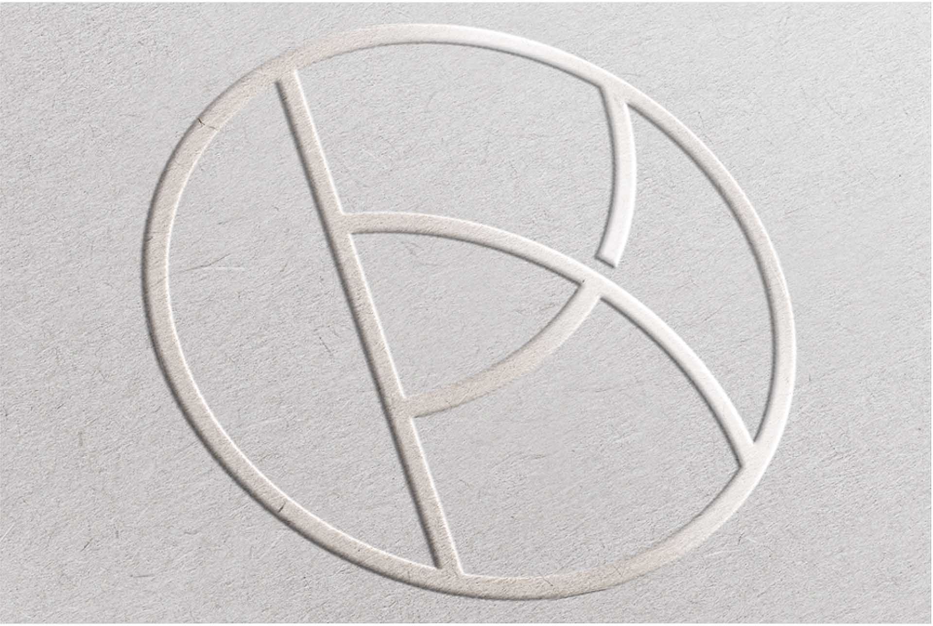
The brand symbol is reminiscent of a food plate, suggesting a well-balanced diet while avoiding direct references to health. The brand mark letter ligature puts a face to Anna Kriss’s nutritional know-how and the exclusive nature of the company’s services. The vibrant green, in combination with a rigid symmetry, makes the design stand out against the traditional brands in the diet sector for a crispy, light, green and well-balanced look.
Design Strategy, Logotype Design, Visual Identity.
