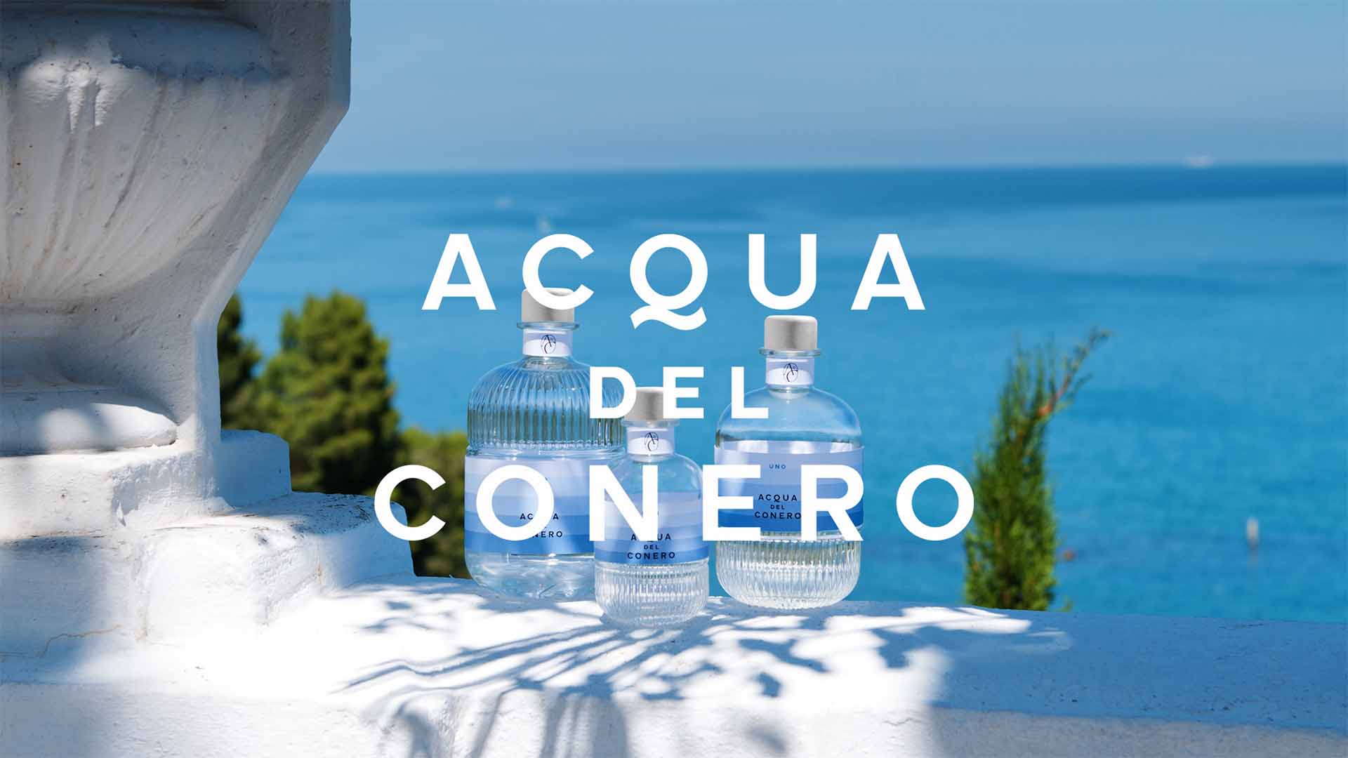
La Pria, new past
La Pria has earned its reputation as the home of outrageously good hand-crafted prosecco but did not want history to stop them from embracing a fresh, new look.
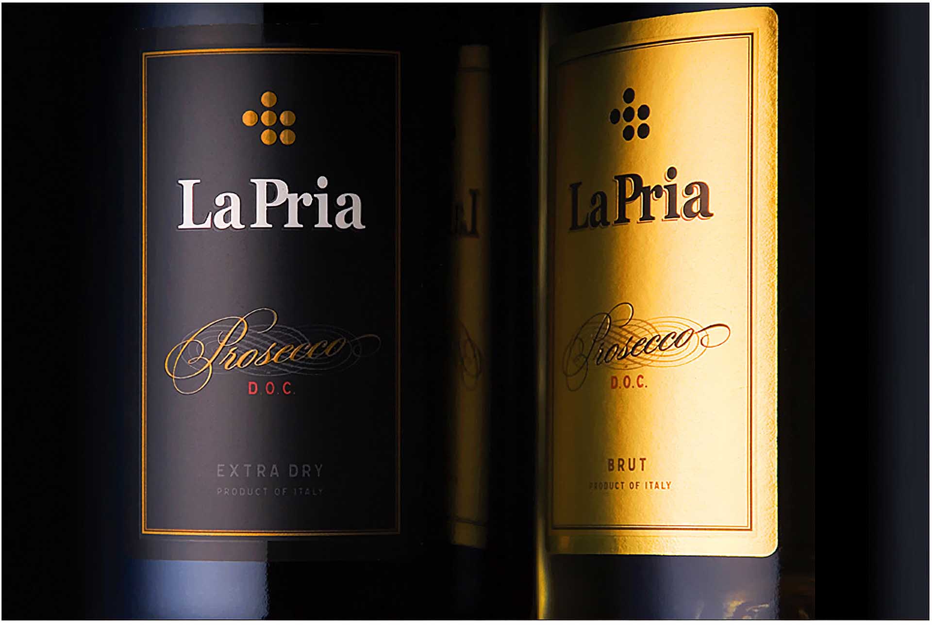
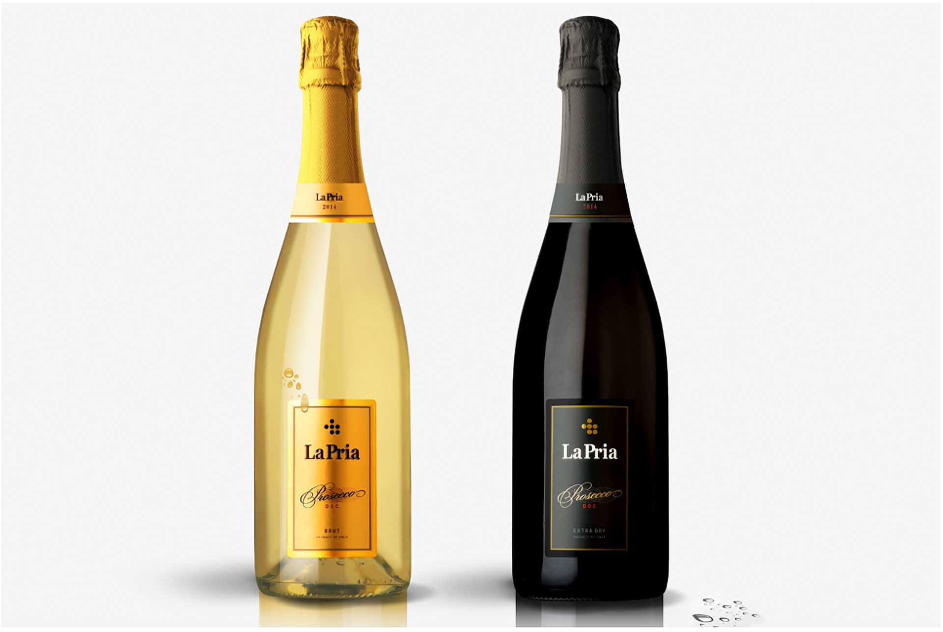
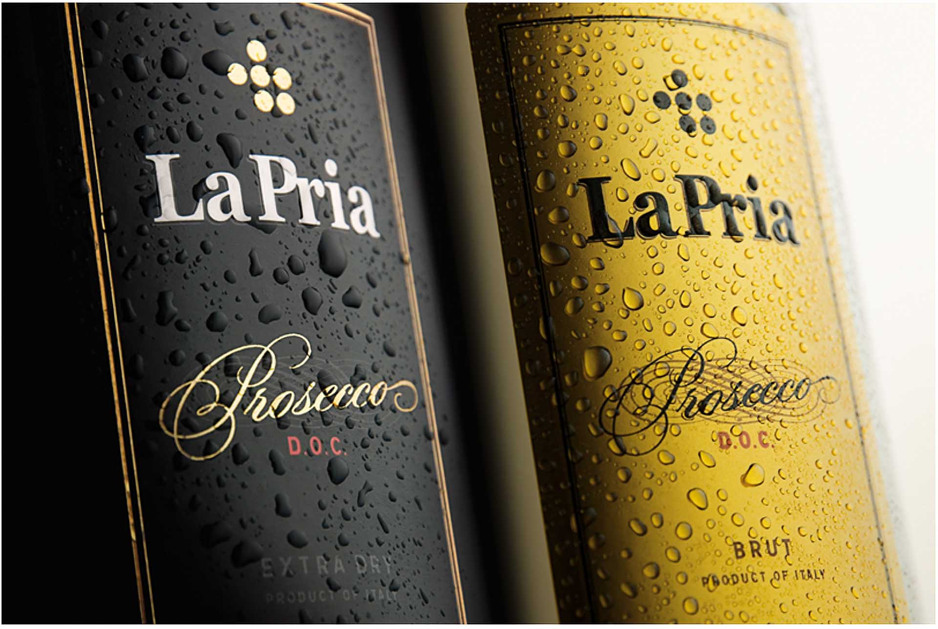
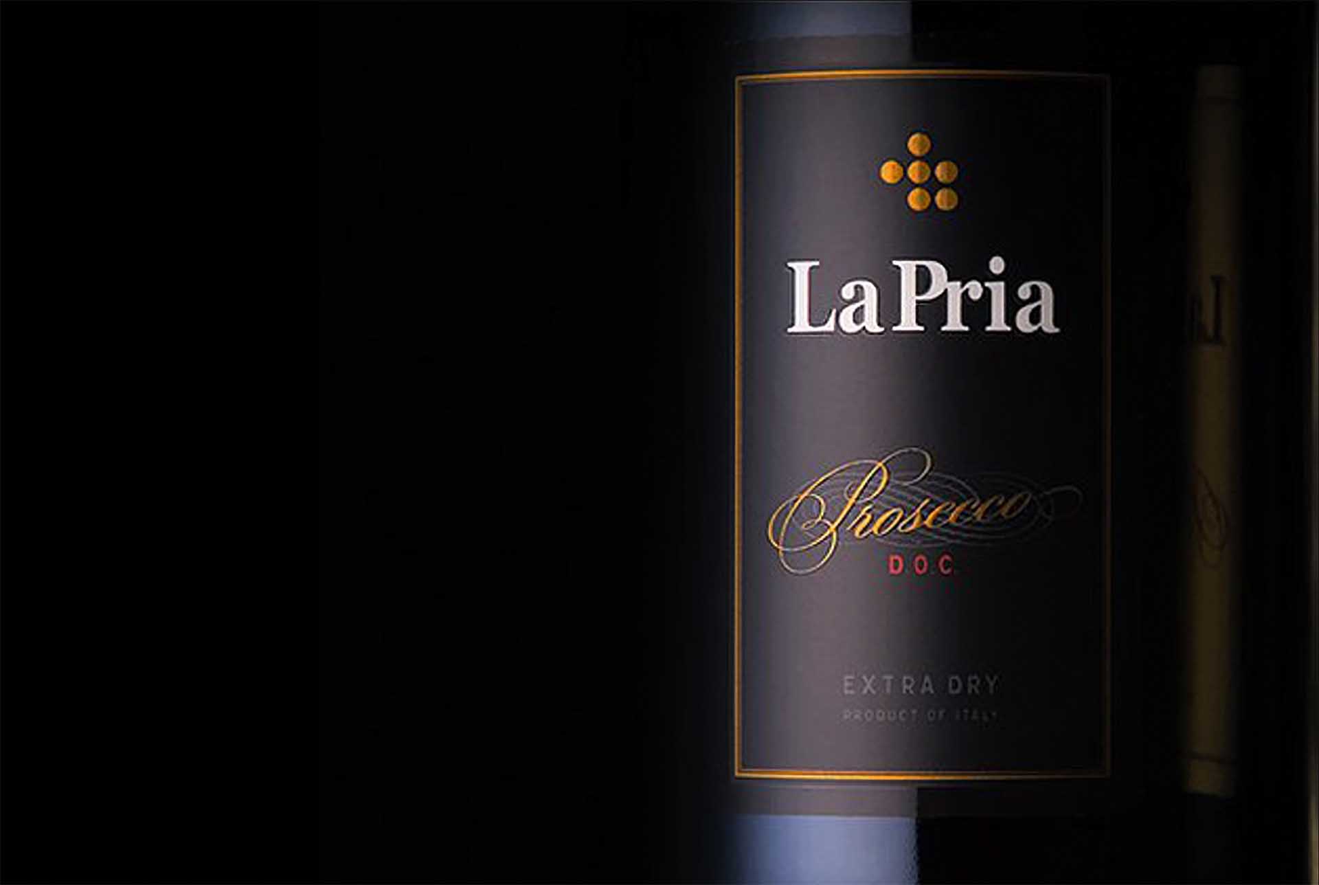
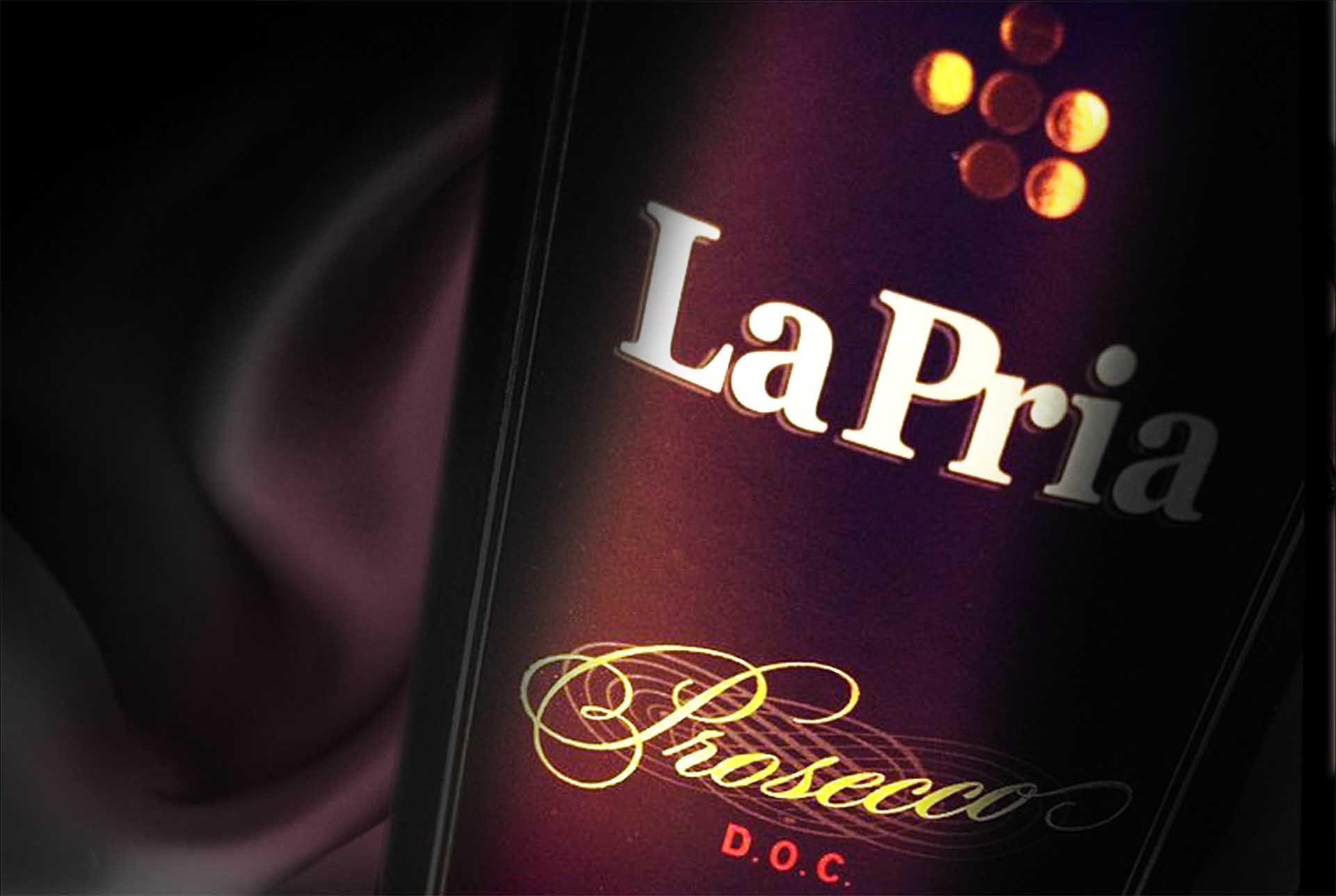
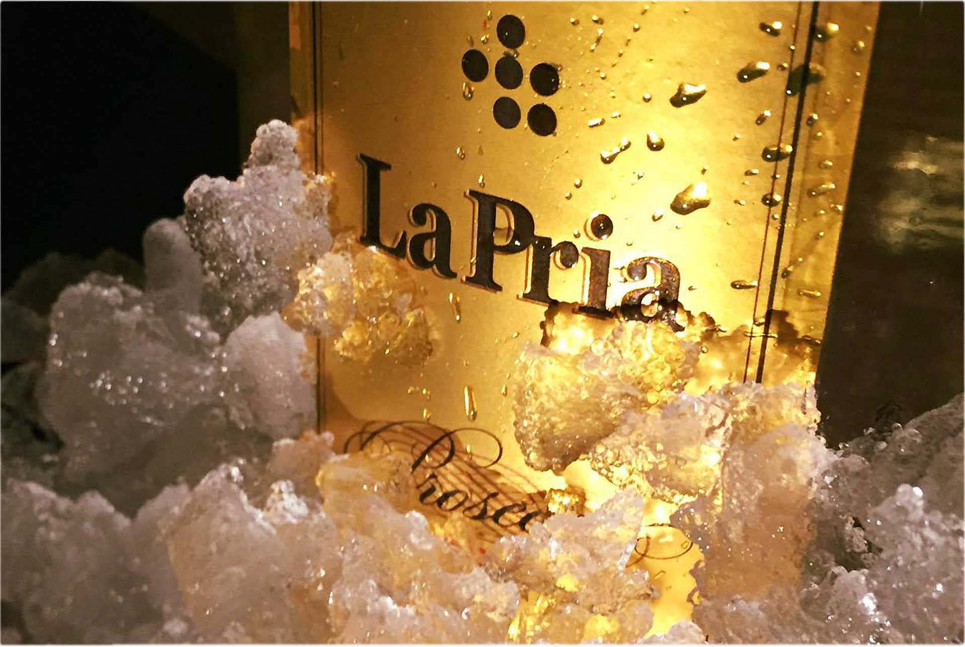
In a category full of redundant decor and overpromise, La Pria wanted to carve out a special place in the consumer’s heart as an honest purveyor of excellent proseccos in a most restrained frame. La Pria is a certified organic winery committed to being the best proseccos for people and the planet. For over two centuries, the family has lovingly cultivated their generous land in the Colli Berici, transforming respect for nature into a drop of pure emotion. With roots dating back to 1779, they entrusted us with the delicate task of breathing fresh new life into the brand—without losing sight of the past.
Early in the design strategy process, we recognised the imperative to bridge the gap between its heritage and the contemporary world, aiming to find a place in the glasses of a new generation. The reimagined icon connects the brand’s heritage with its refreshed premium positioning, representing cultural depth and modern aspirations.
Design Strategy, Logotype Design, Visual Identity, Packaging Design.