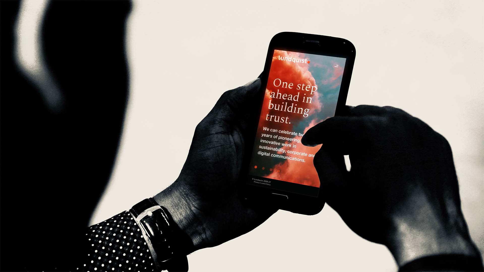
Lundquist, Connecting the dots
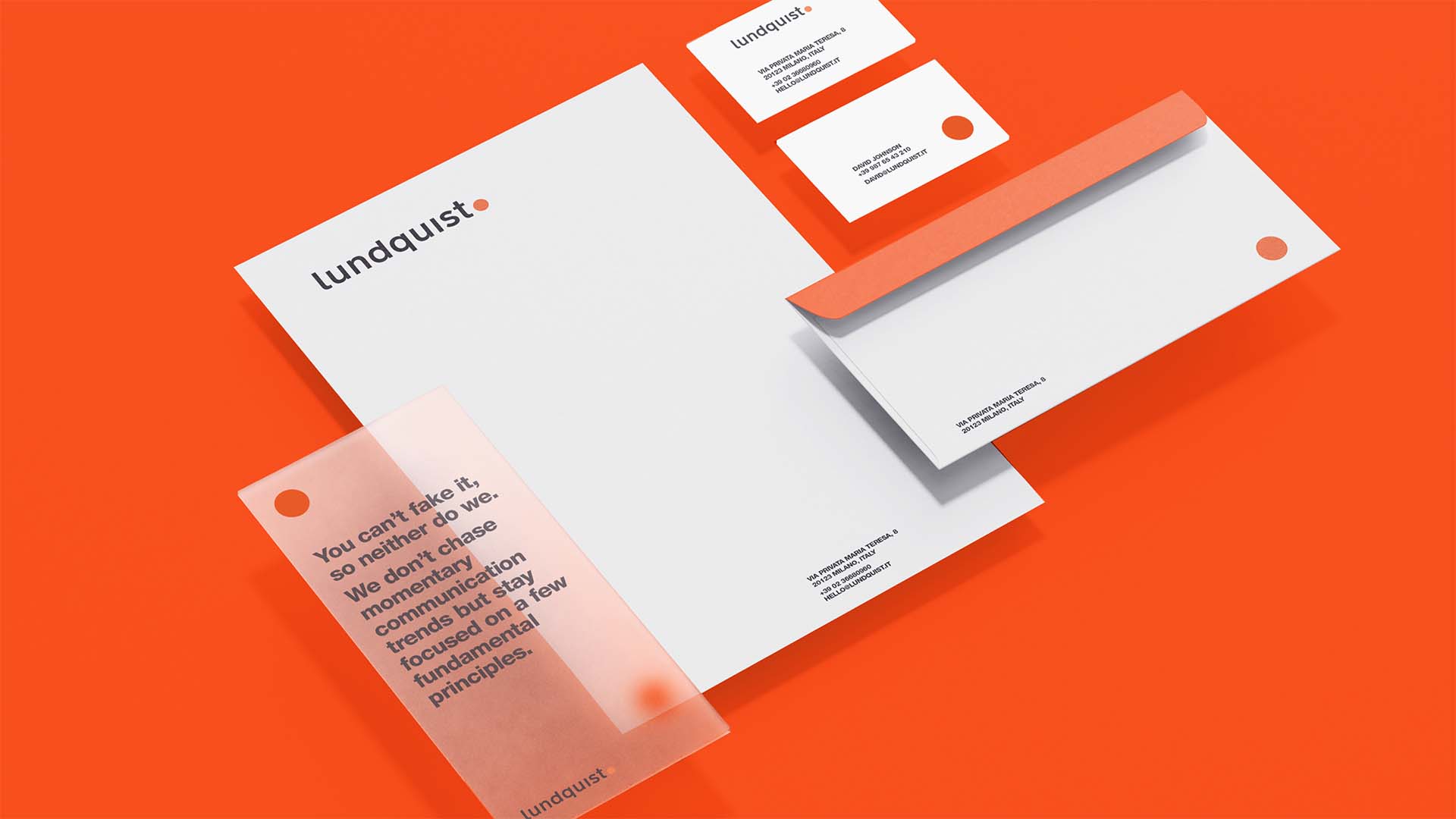
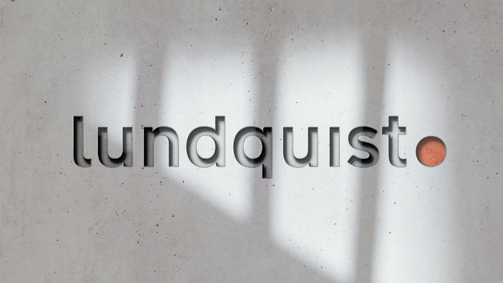
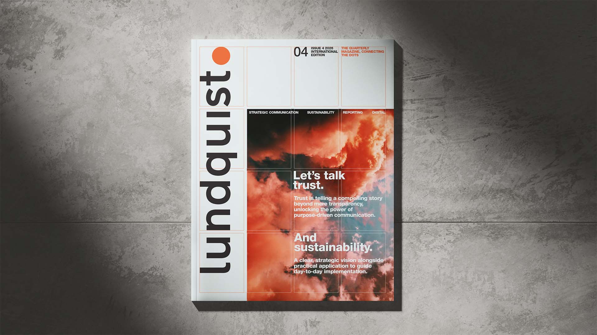
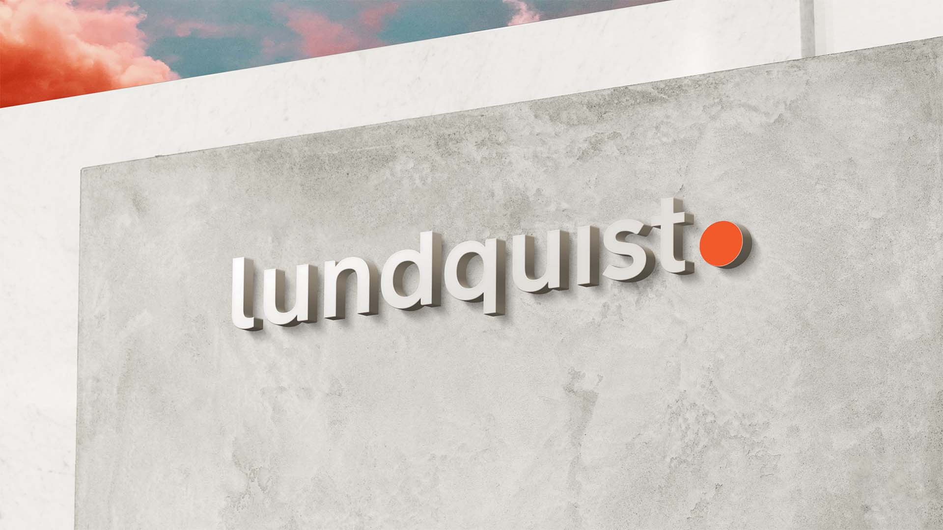
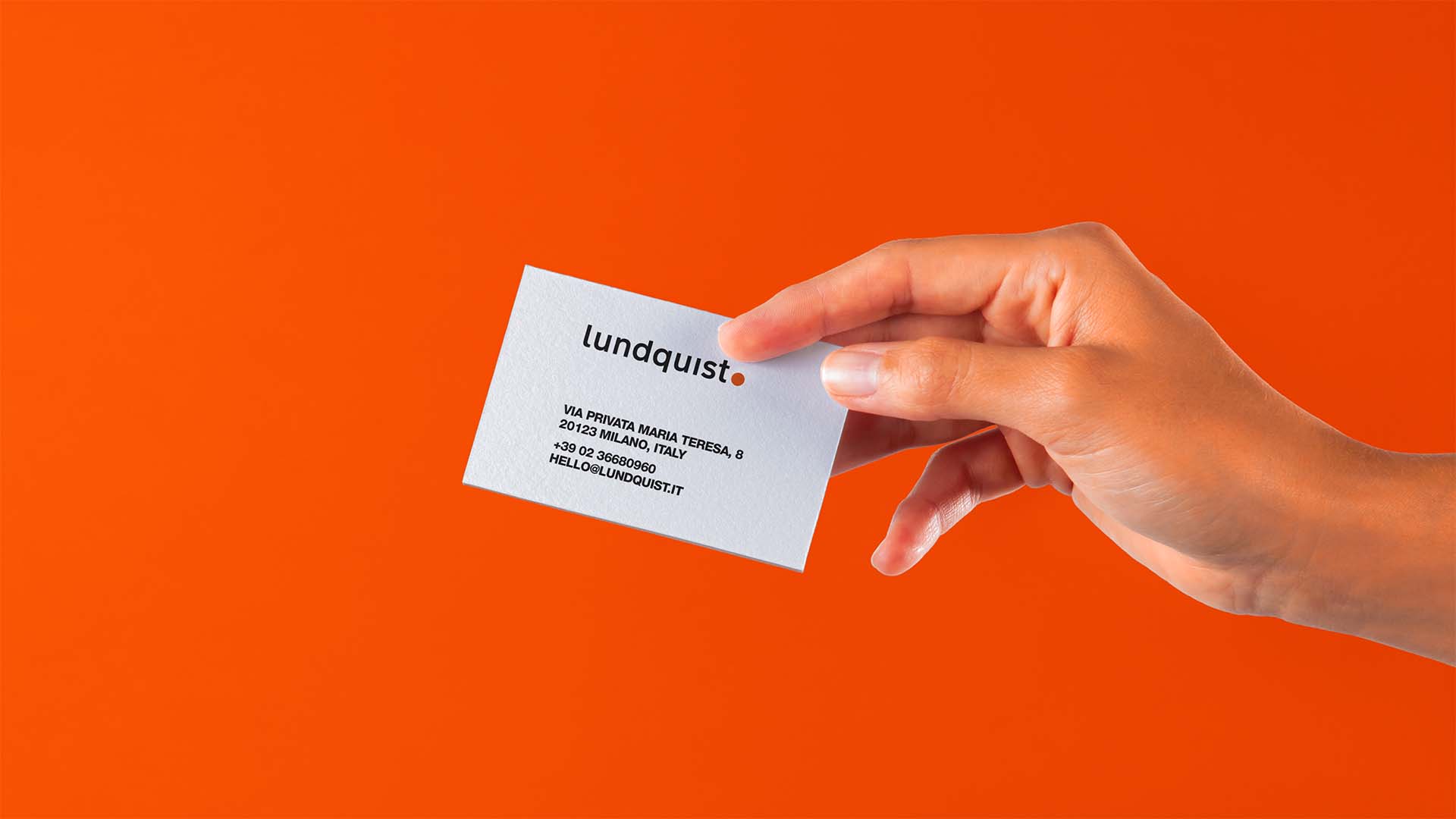
We established a fresh visual identity for Lundquist, leaders in corporate communication. A simple dot serves as a storytelling element that advances their sustainability mission and embodies the motto ‘Together we can do better’.
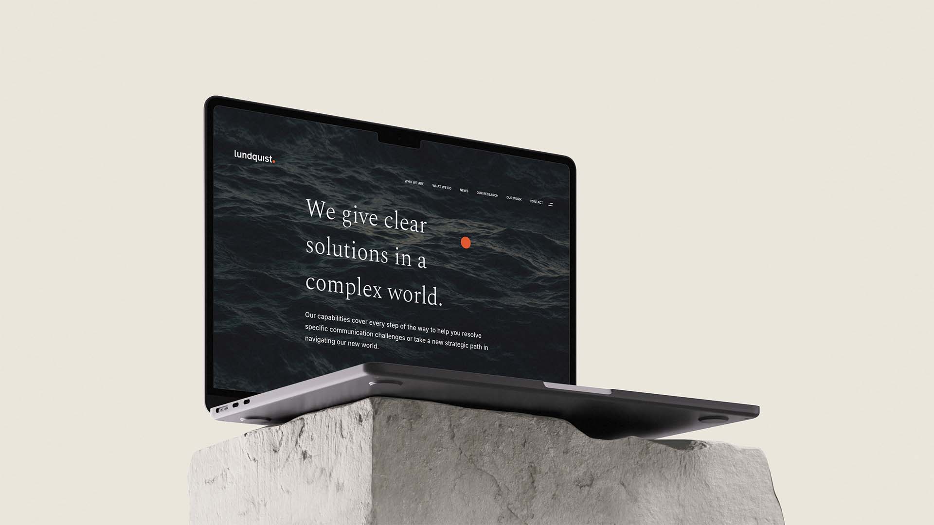
Through research, analysis, and solid execution, Lundquist builds robust strategies and executes tailored communication solutions for digital channels and reporting.
Lundquist partnered with Smith for an ambitious redesign, aiming for a minimalistic look where every aspect of the new design reflects their self-assured attitude.
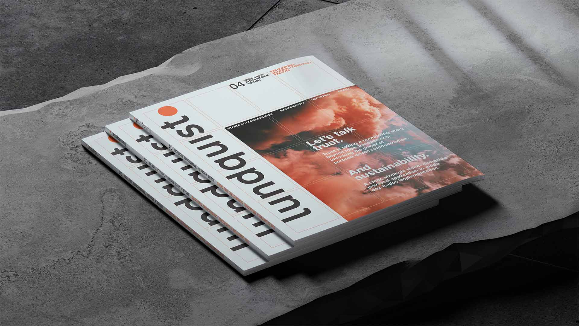
In marketing materials and campaigns, a large, stylized dot comes alive in vibrant orange, emphasizing the ‘Connecting the Dots’ and ‘Making a Point’ initiatives essential in communication. Meanwhile, the bold lettermark is rhythmically spaced as if typed on a typewriter as a testimony to their commitment to creating sound reports.
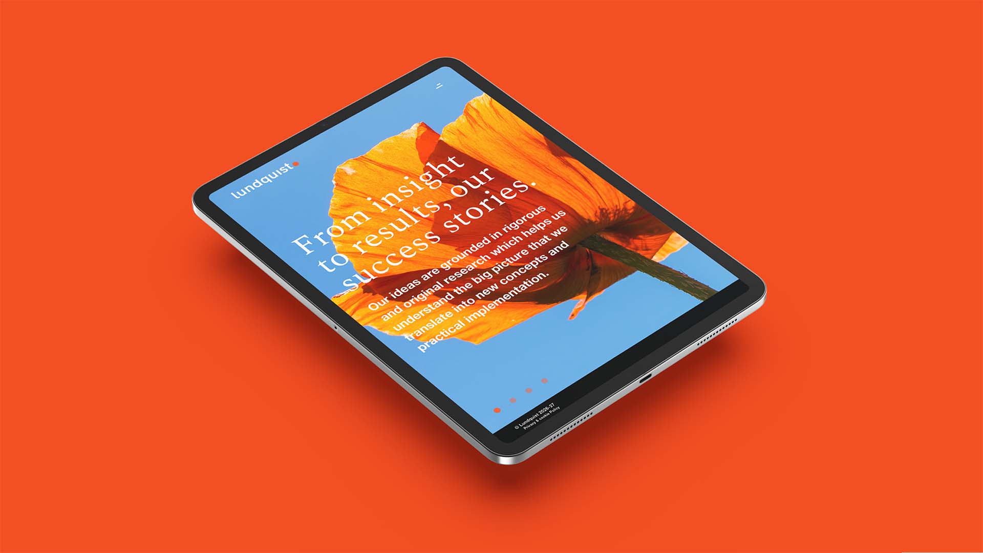
See our digital platform design lundquist.it
Design Strategy, Copywriting, Logotype Design, Visual Identity, Digital Design, Web Design.

Innovative solutions.
Smith helped us think outside the box, providing cutting-edge solutions that streamlined our entire process. It’s an identity that is very simple to adapt even internally and gives us an edge across all brand touchpoints. Pixelperfect every time.
Joakim Lundquist, Founder