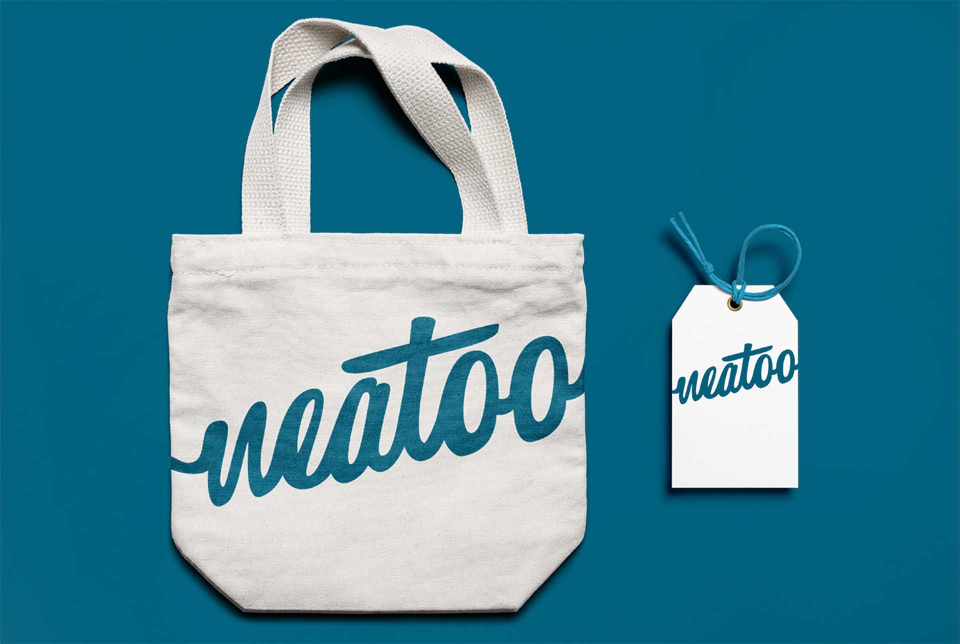
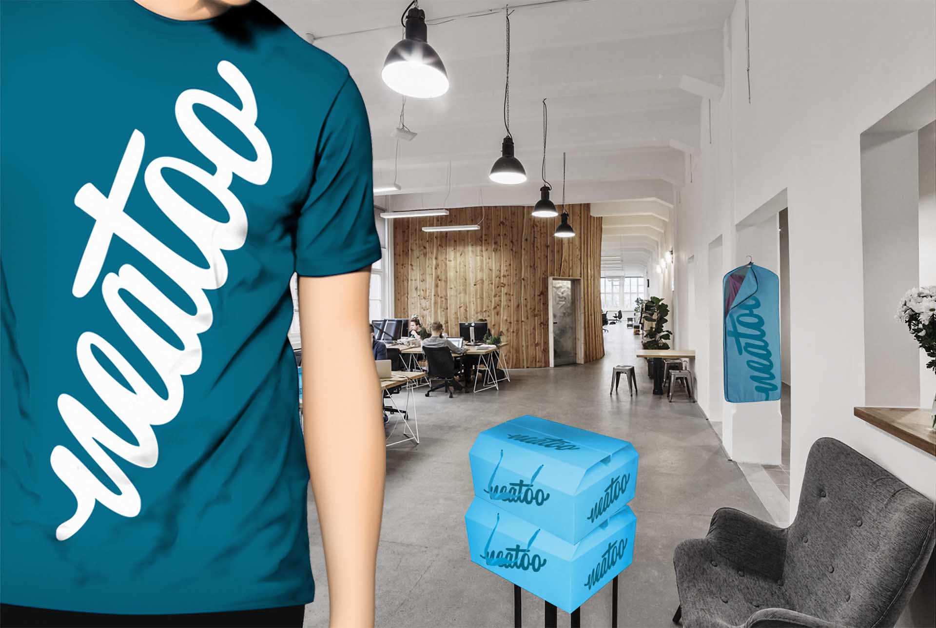
Neato, positively fresh
We were tasked with giving the unseen a name, a look, a feel. With a click on an app, your garments are picked up, laundered, ironed and delivered when and where you choose.
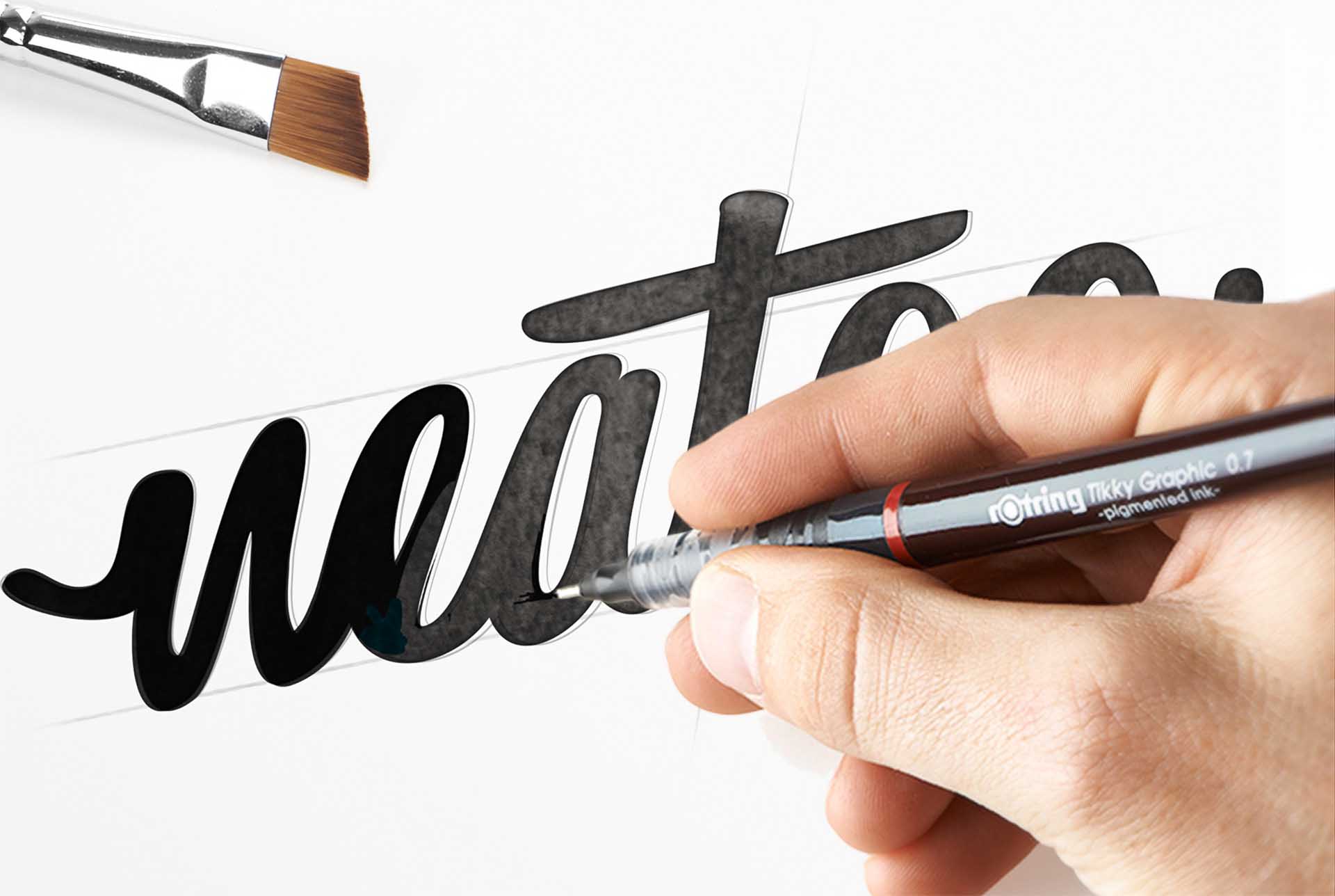
Our team worked with the brand’s founder on the total brand creation, developing a strong brand identity, and establishing a strategic vision with measured aesthetics for a new brand, giving it that cordial and warm sense you’d expect from your local laundry service. To us, a brand name is a compelling story reduced to its most reduced but most engaging form. Part of our challenge was finding a memorable name: ‘Neat’ means immaculate, and ‘neato’ is an expression of appreciation, the name effectively communicates its values.
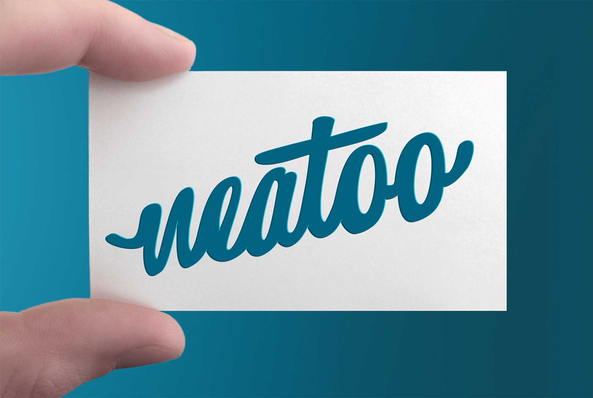
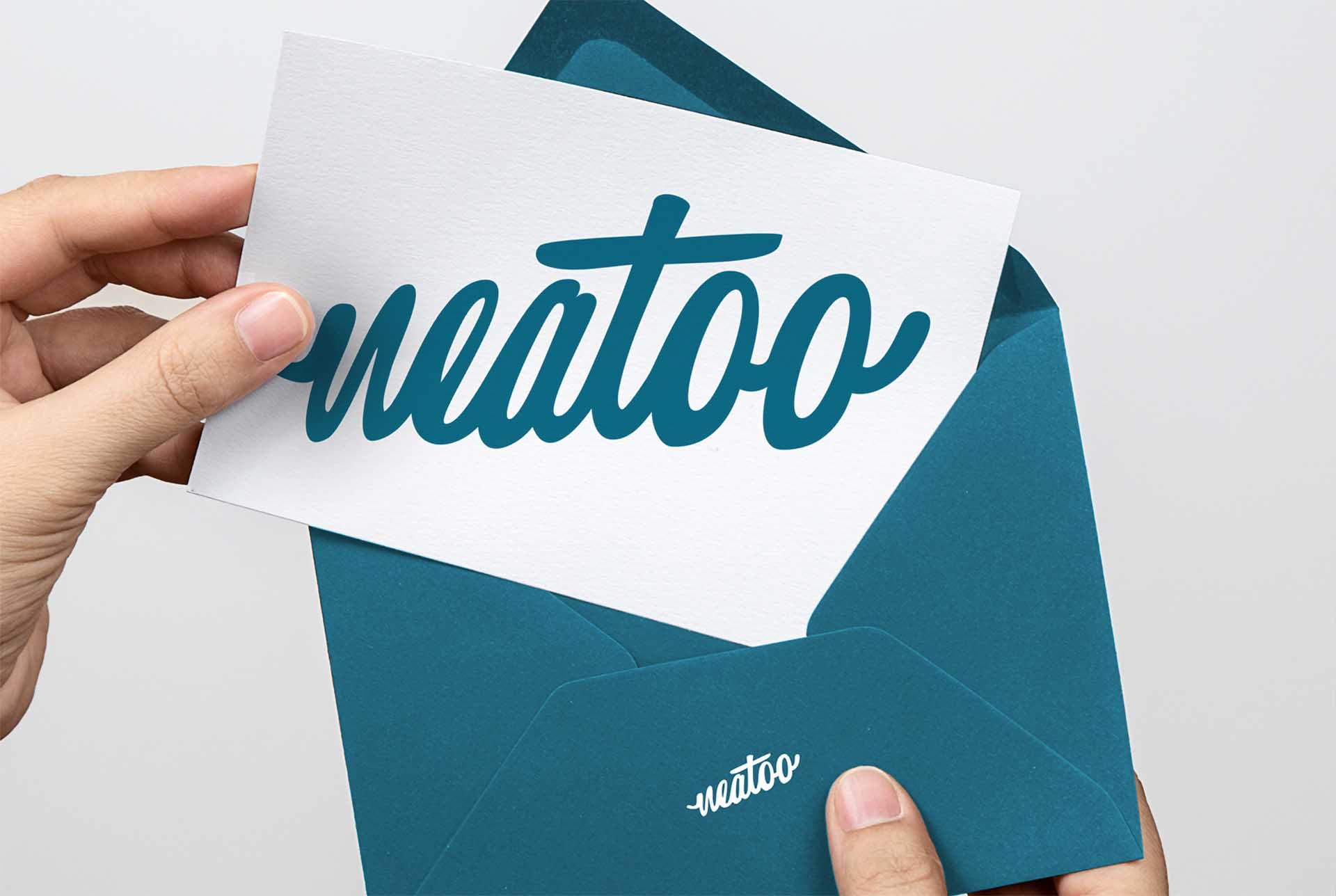
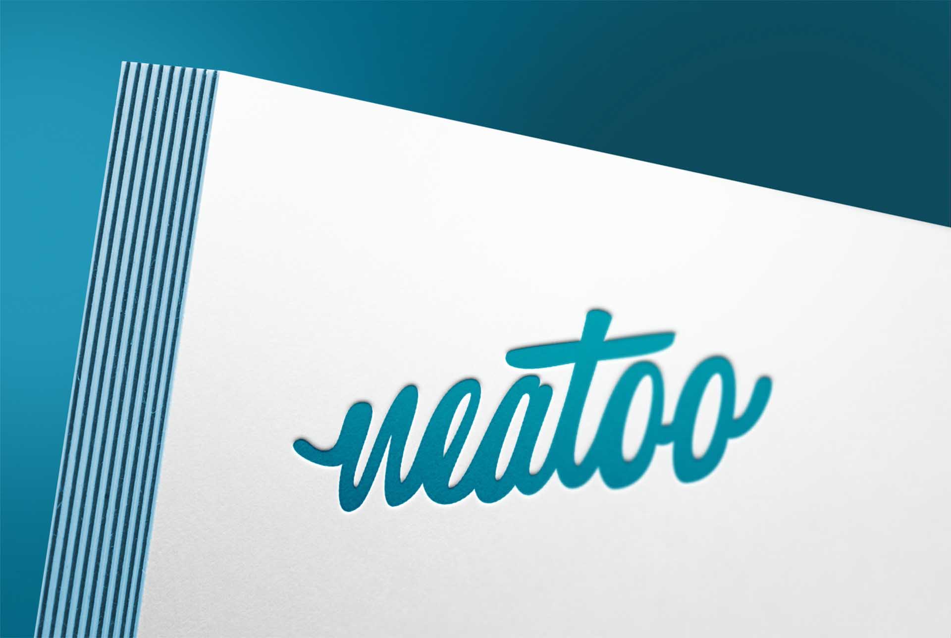
The amiable hand-drawn logo is reminiscent of the logos used in the era when dressing neatly was a badge of honour, and the ocean blue brand colour conveys a crispy feel of freshly laundered clothes across packaging, brand world and digital communication. Speckless, super-fast and good-natured laundry service at the tip of your finger with a promising, fresh and compelling visual identity.
Design Strategy, Naming & Storytelling, Logotype Design, Visual Identity, Packaging Design.