Pian del Bichi, perfectly good
Our objective was to reposition Pian del Bichi as a refreshing and easy-to-drink wine that hails from a reputable region, perfectly suited for those relaxed occasions when good is just perfect.
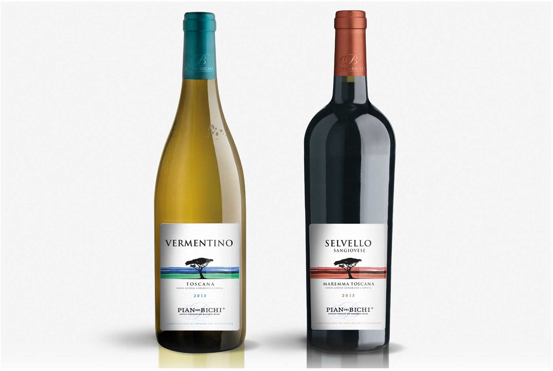
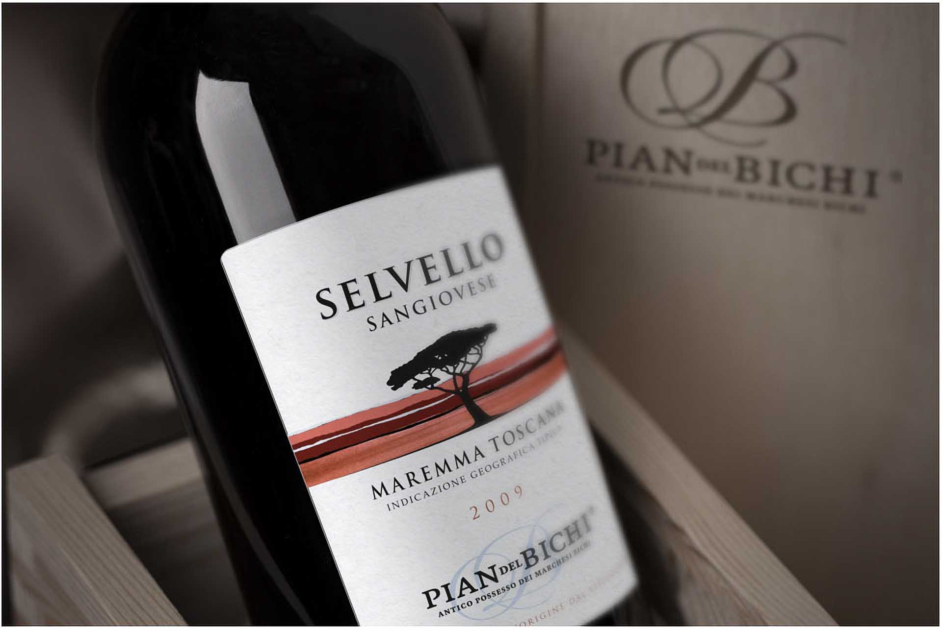
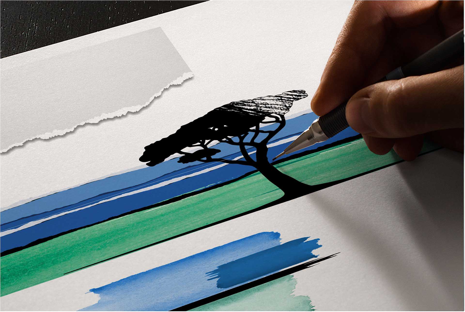
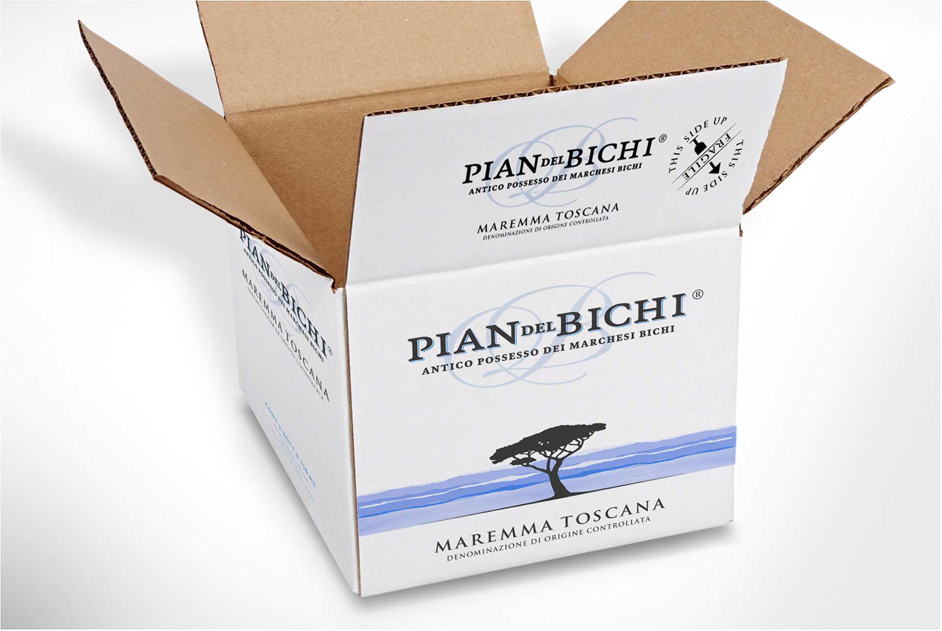
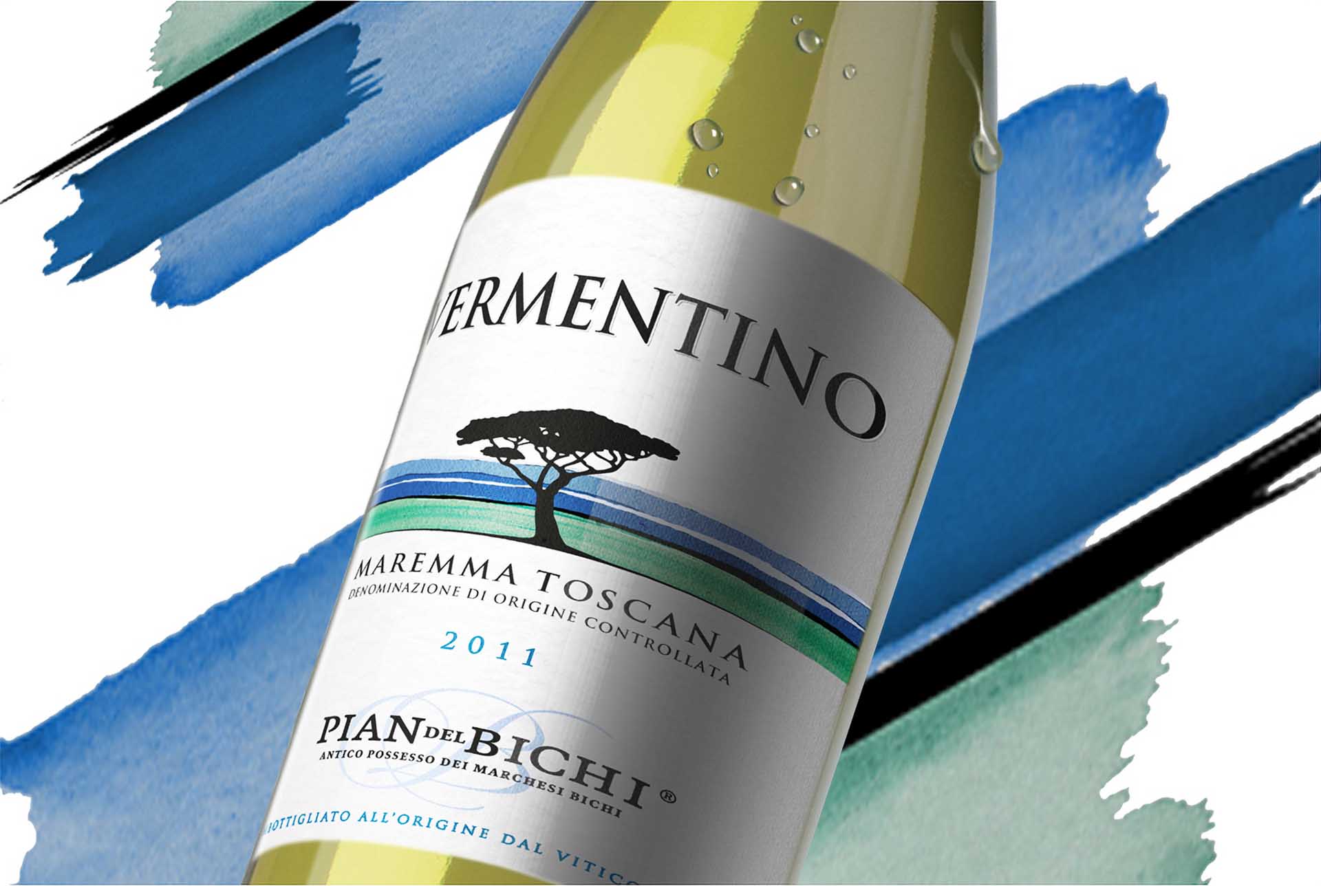
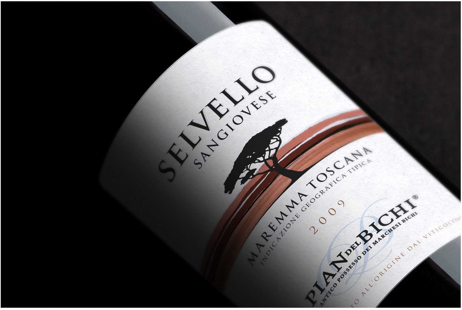
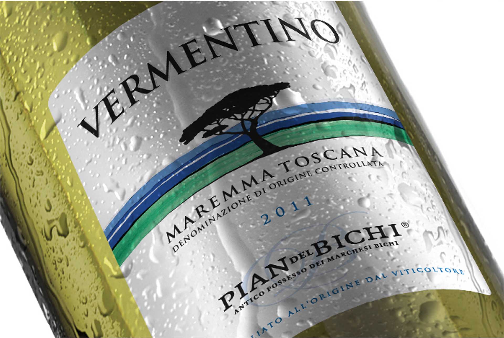
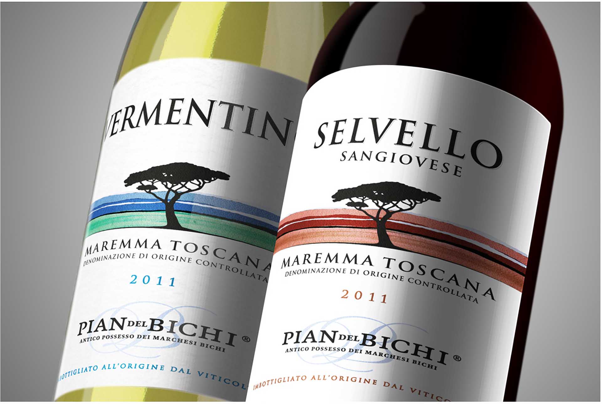
In a market marked by hyperbole and pretentious branding—think heraldic symbols and intricate gold embellishments—Pian del Bichi distinguishes itself by embracing a straightforward and authentic identity. With a taste profile compared to a young and giggly girl, fresh and unaffected was the key. The label so captures the essence of its origins, featuring a sole maritime pine, rolling hills, and the sea—all conveyed without any pretensions with light watercolour brush strokes.
With a clear product positioning strategy and look that speaks directly to consumers, Pian del Bichi has carved out a niche for itself in the marketplace. It now is recognised as a quality, reasonably priced wine that delivers on promises every time. This approach eschews the misleading claims that often plague the industry, instead inviting wine enthusiasts to appreciate the true, uncomplicated pleasure of a well-crafted bottle without pretensions—a reliable choice for easy enjoyment when extraordinary is too much.
Design Strategy, Communication Strategy, Logotype Design, Visual Identity, Packaging Design.