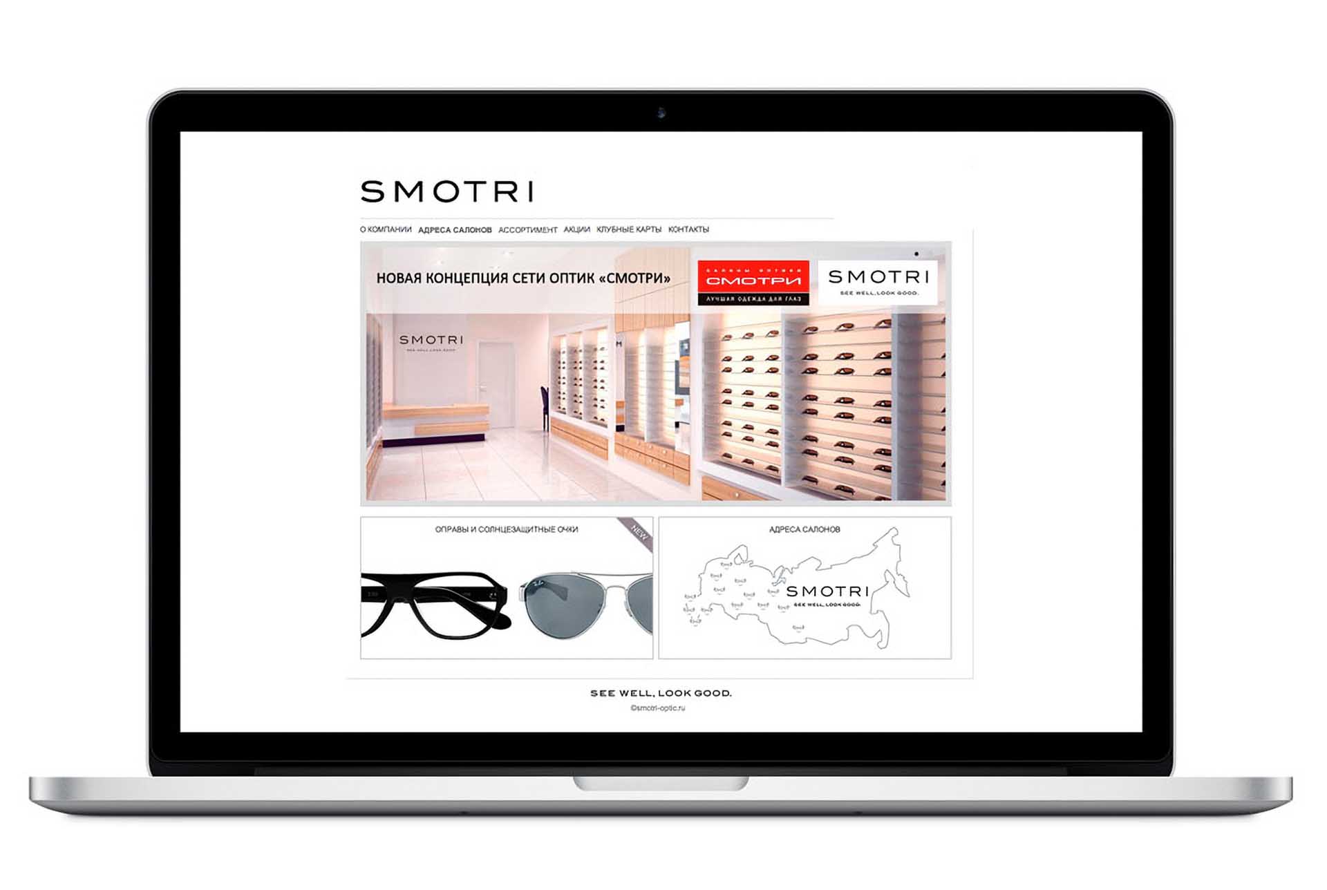
Smotri, see well – look good.
As Russian СМОТРИ was looking to reassert its expertise and leadership with a full brand repositioning, our challenge was a complete rebrand and brand elevation.
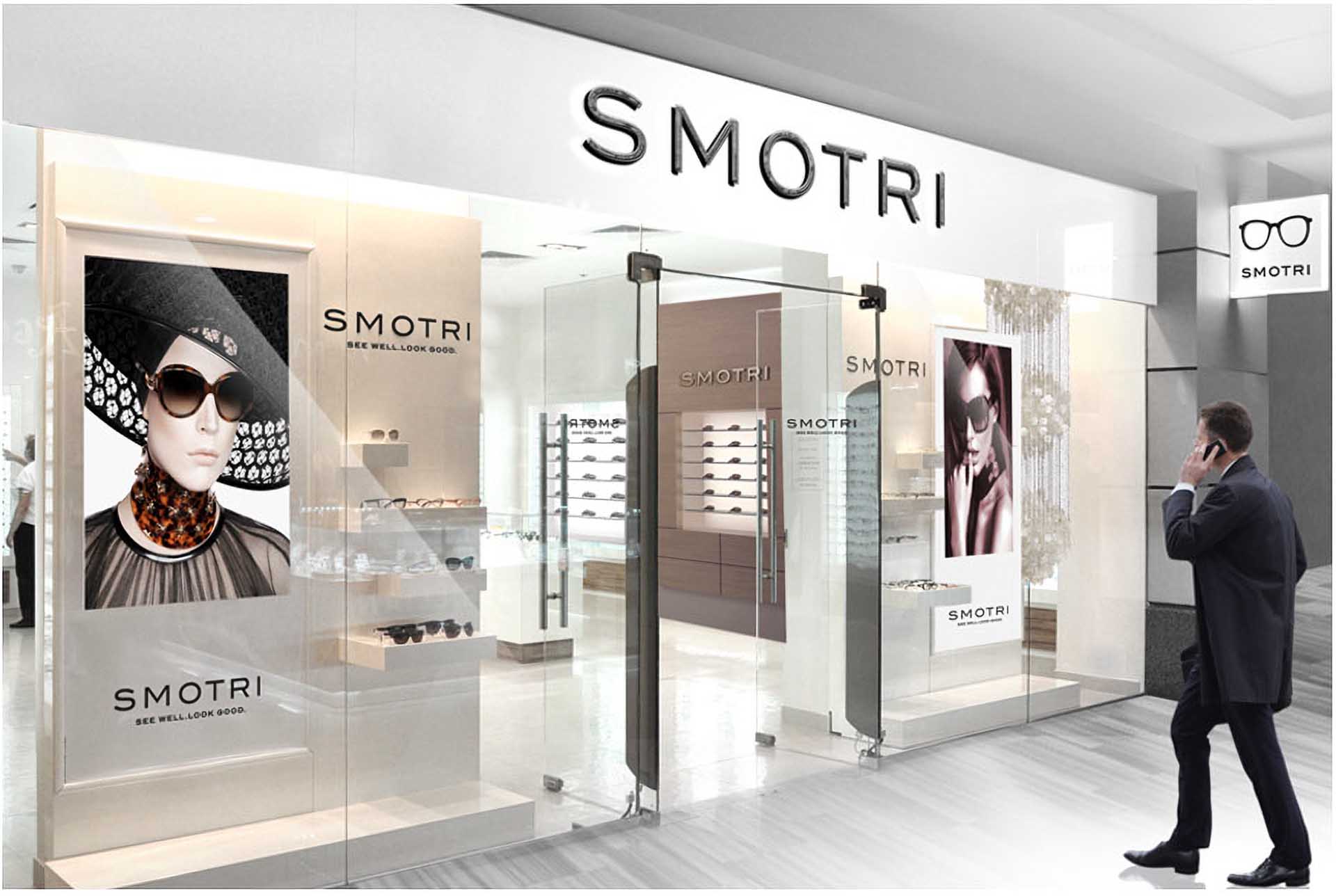
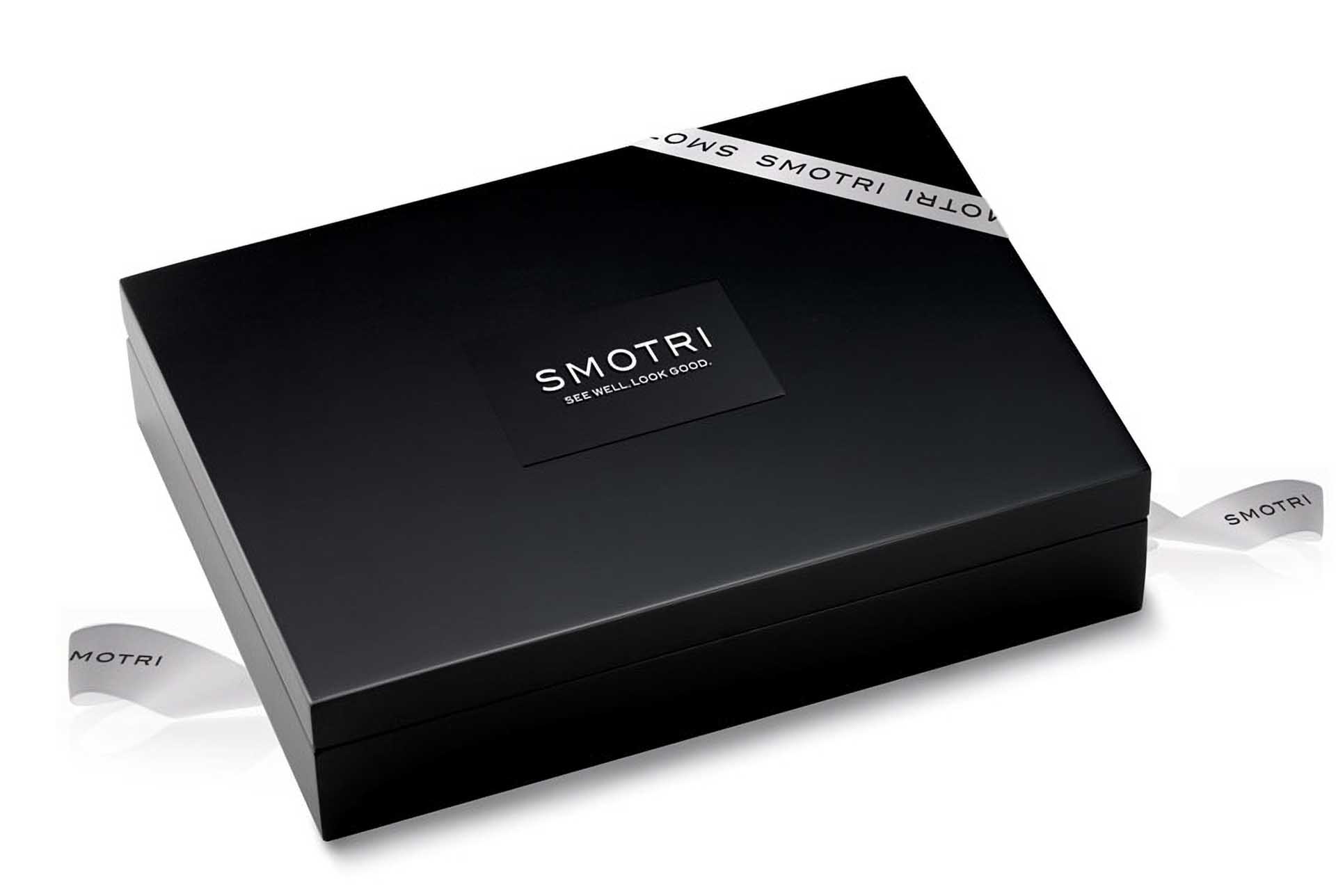
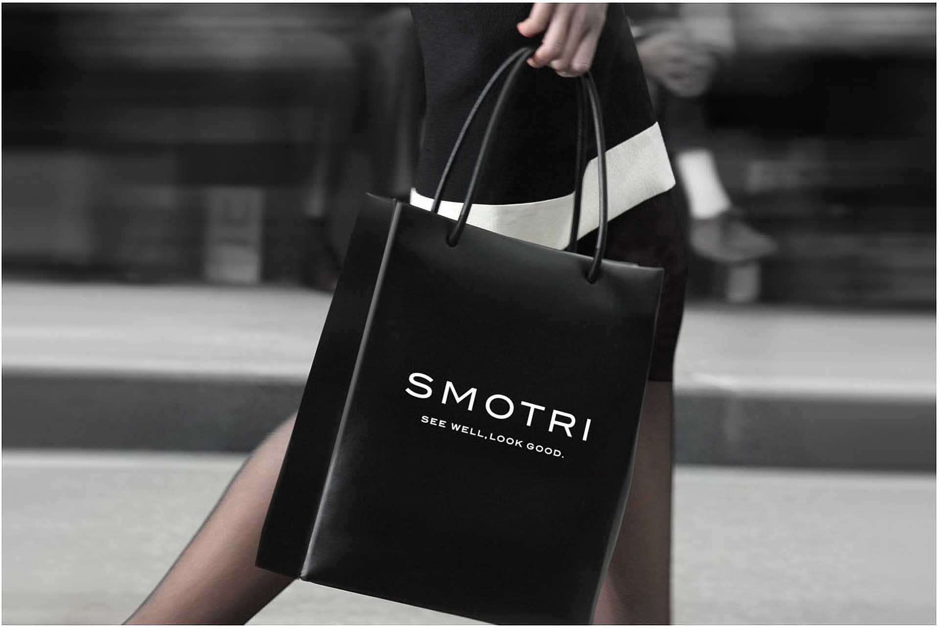
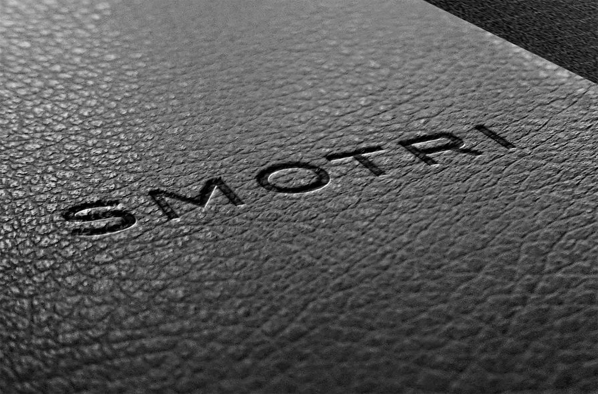
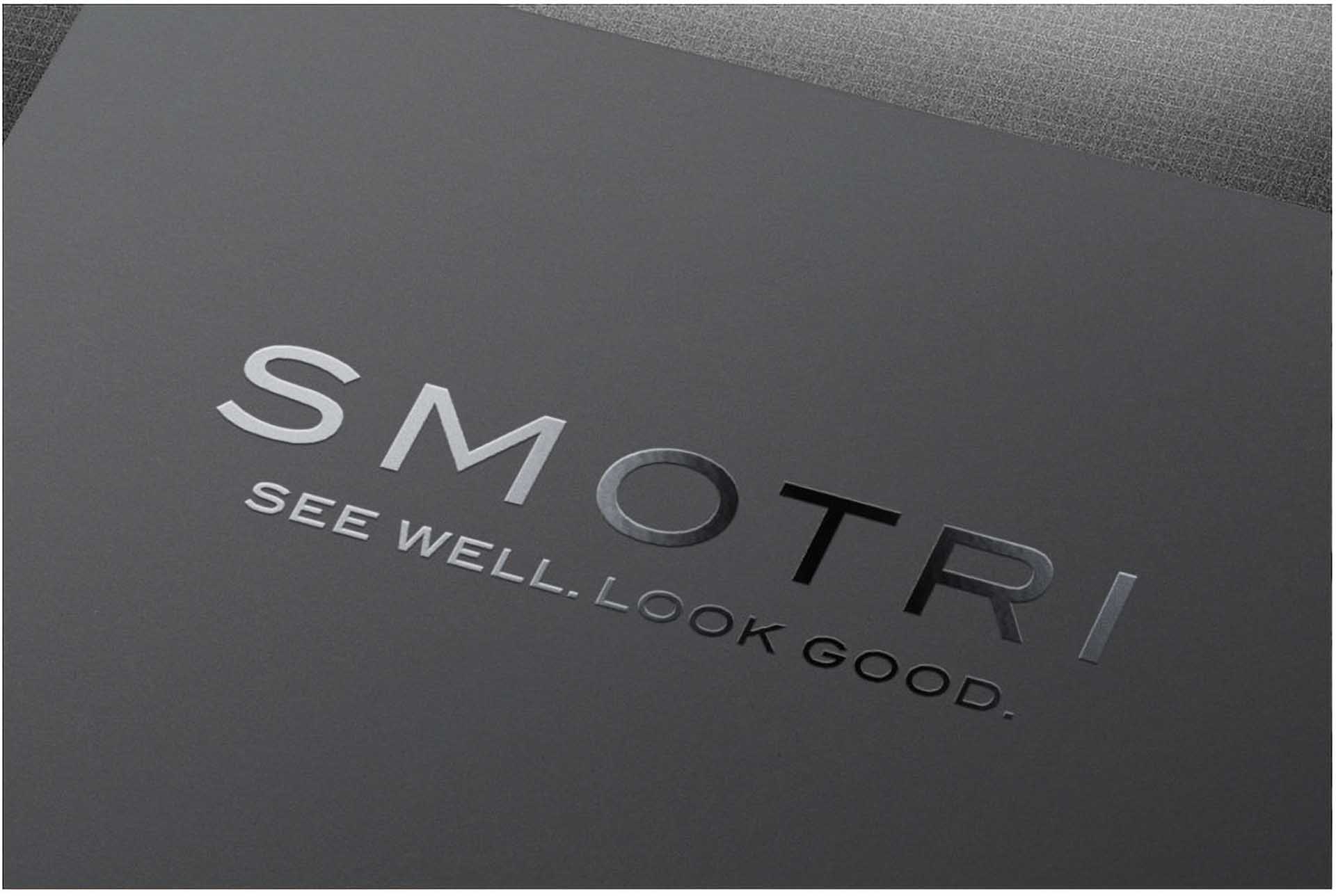
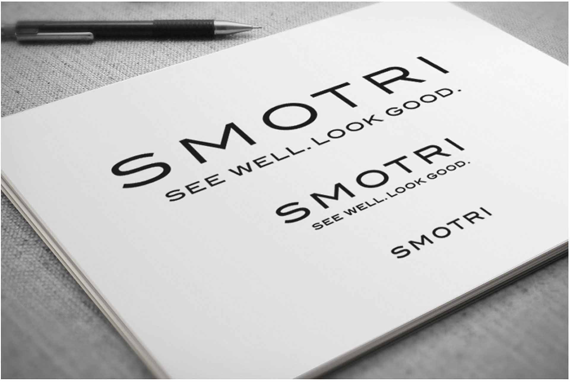
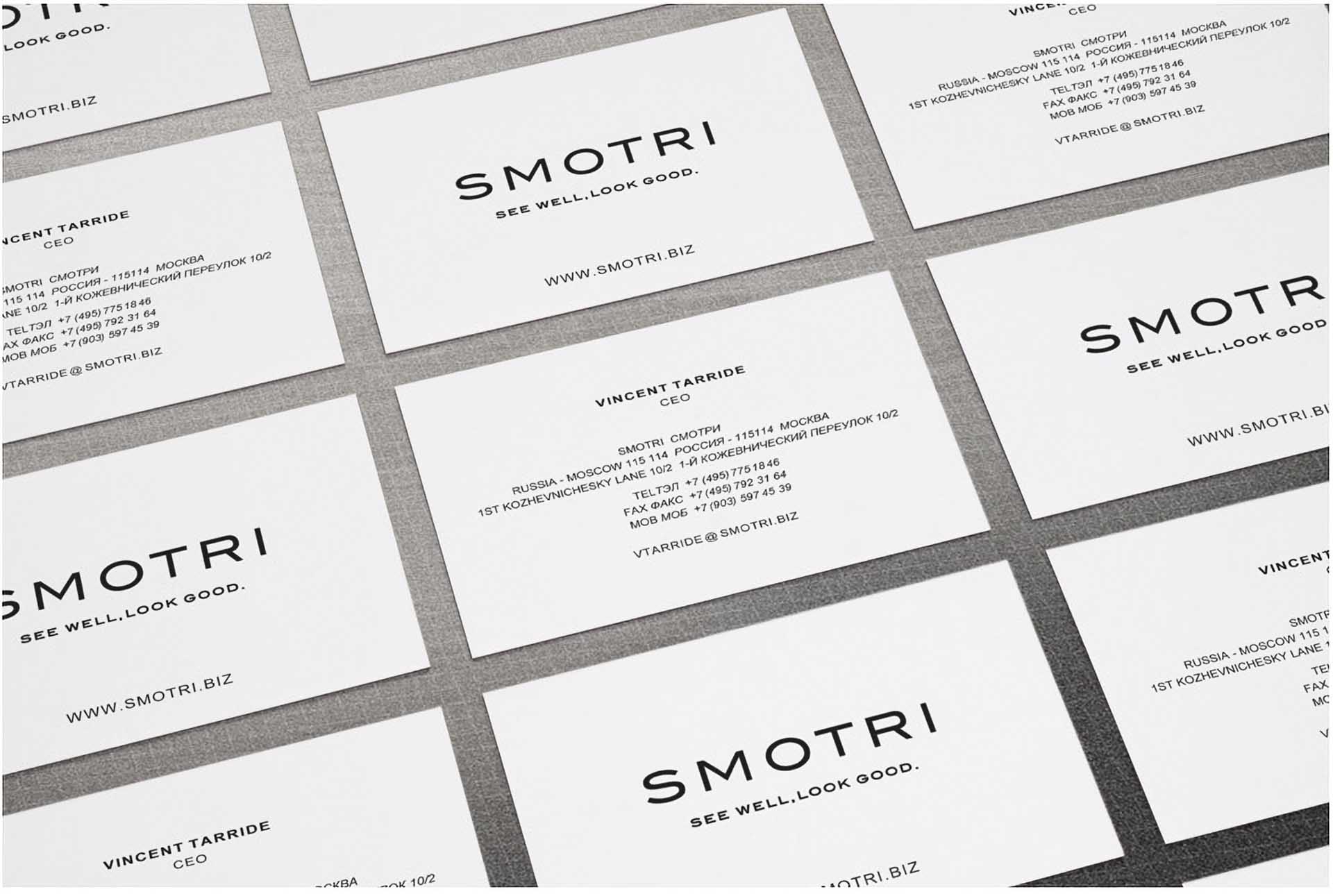
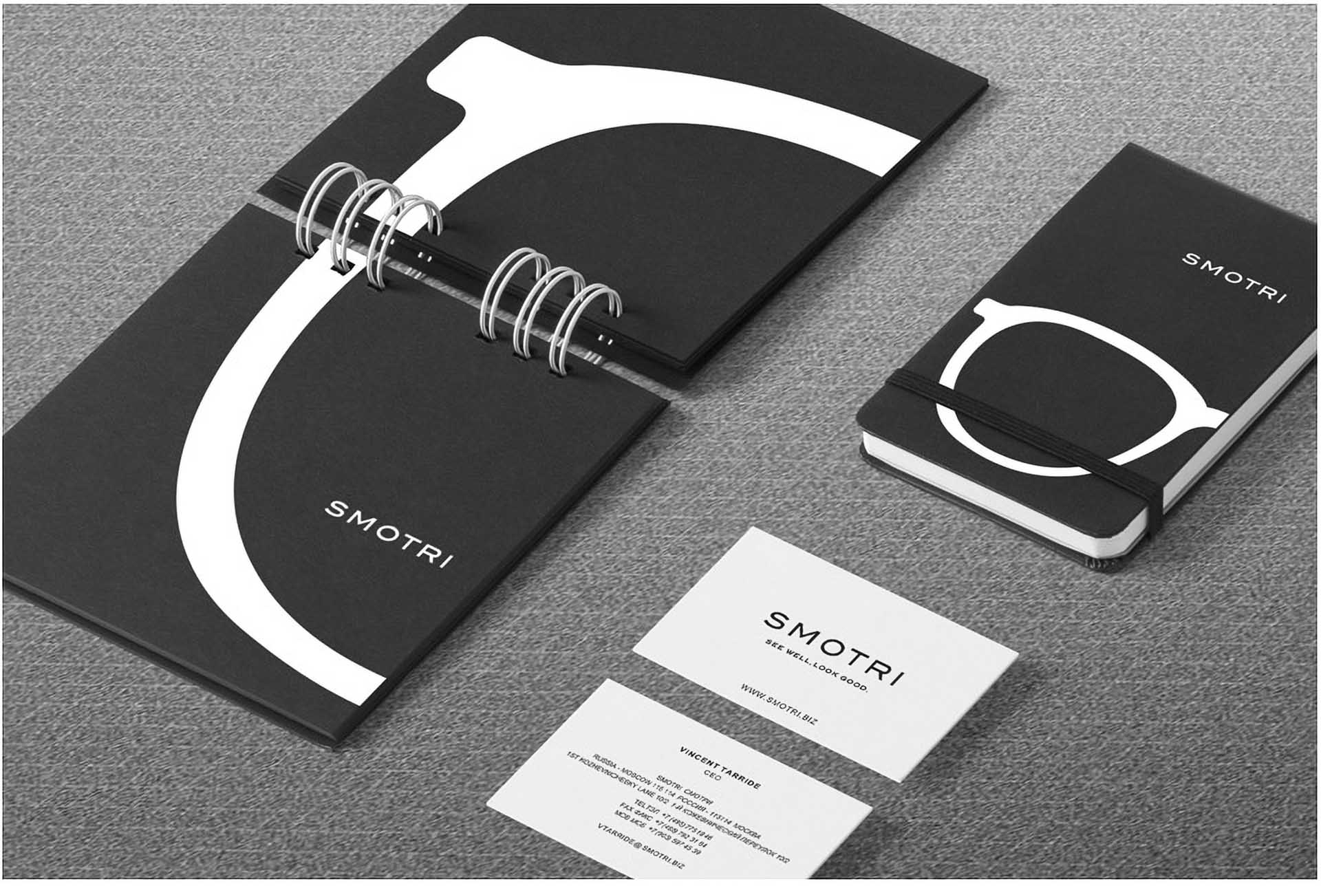
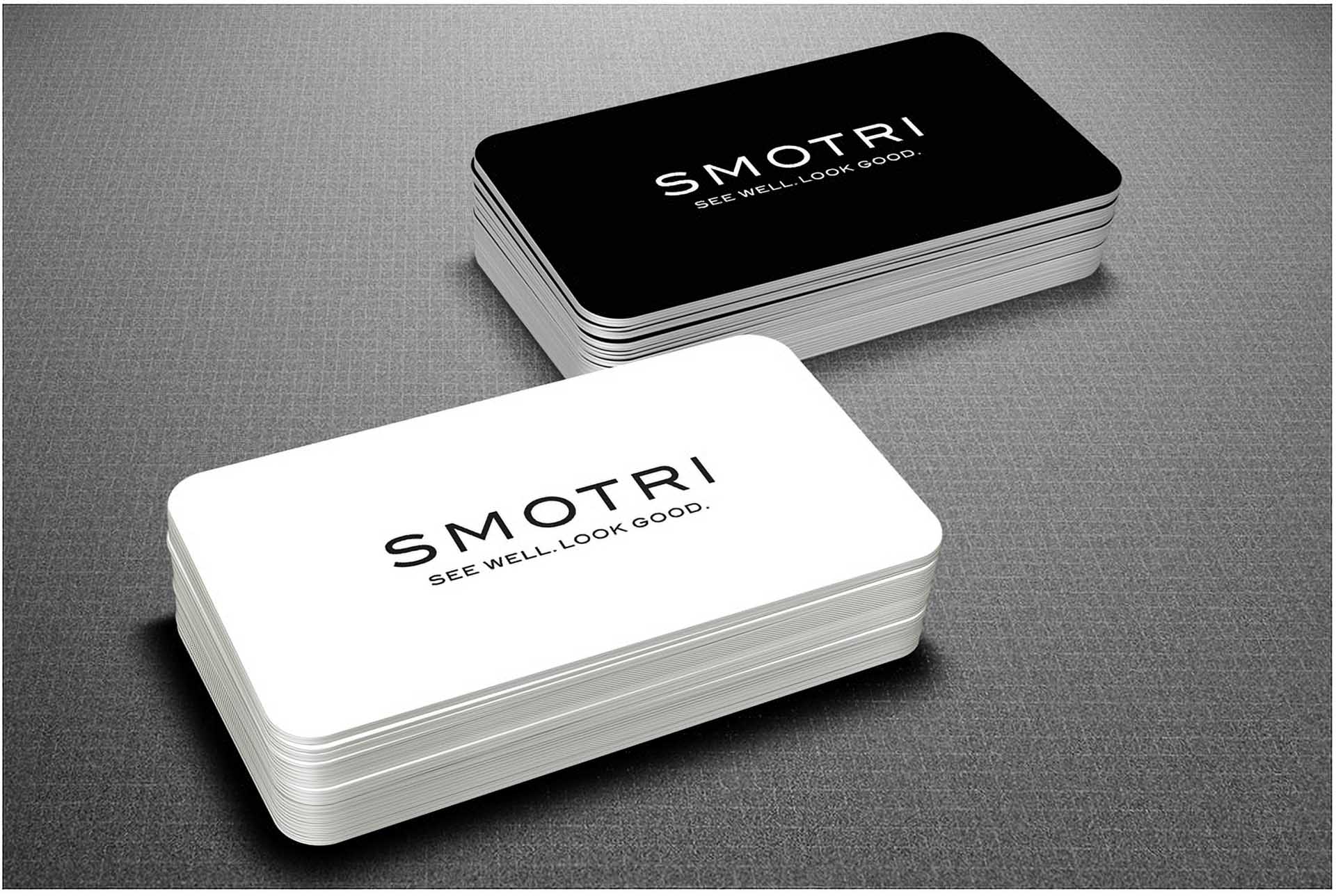
The goal was to reaffirm its position as Russia’s preferred retail brand for international eyewear, and the custom-designed logotype firmly establishes Smotri as an iconic and cosmopolitan brand. The phonetic translation of the Russian word СМОТРИ, meaning ‘look’ emphasises its role as the leading Russian purveyor of international eyewear, complete with optometrists and opticians on-site to assist customers—our tagline ‘See well. Look good.’ perfectly captures this mission.
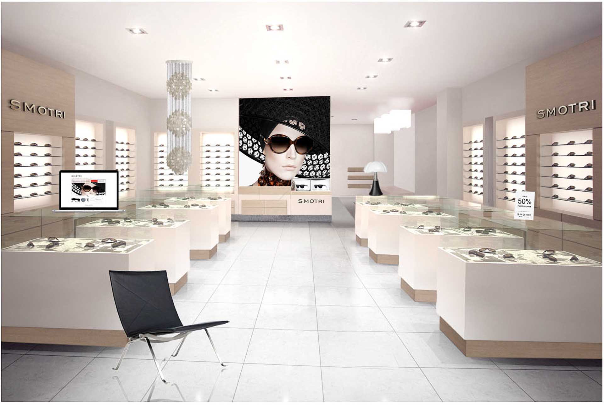
This new design marks a significant departure from the outdated and overwhelmingly red, opulent retail spaces—transitioning the brand to a fresh and modern aesthetic. The revamped identity, applied throughout the entire brand experience, connects customers directly to what matters most—the eyewear. The brand design was first implemented at the flagship store in Moscow and has since been rolled out to all of Smotri’s locations across Russia, showcasing its iconic status of having the confidence not to overdo things.
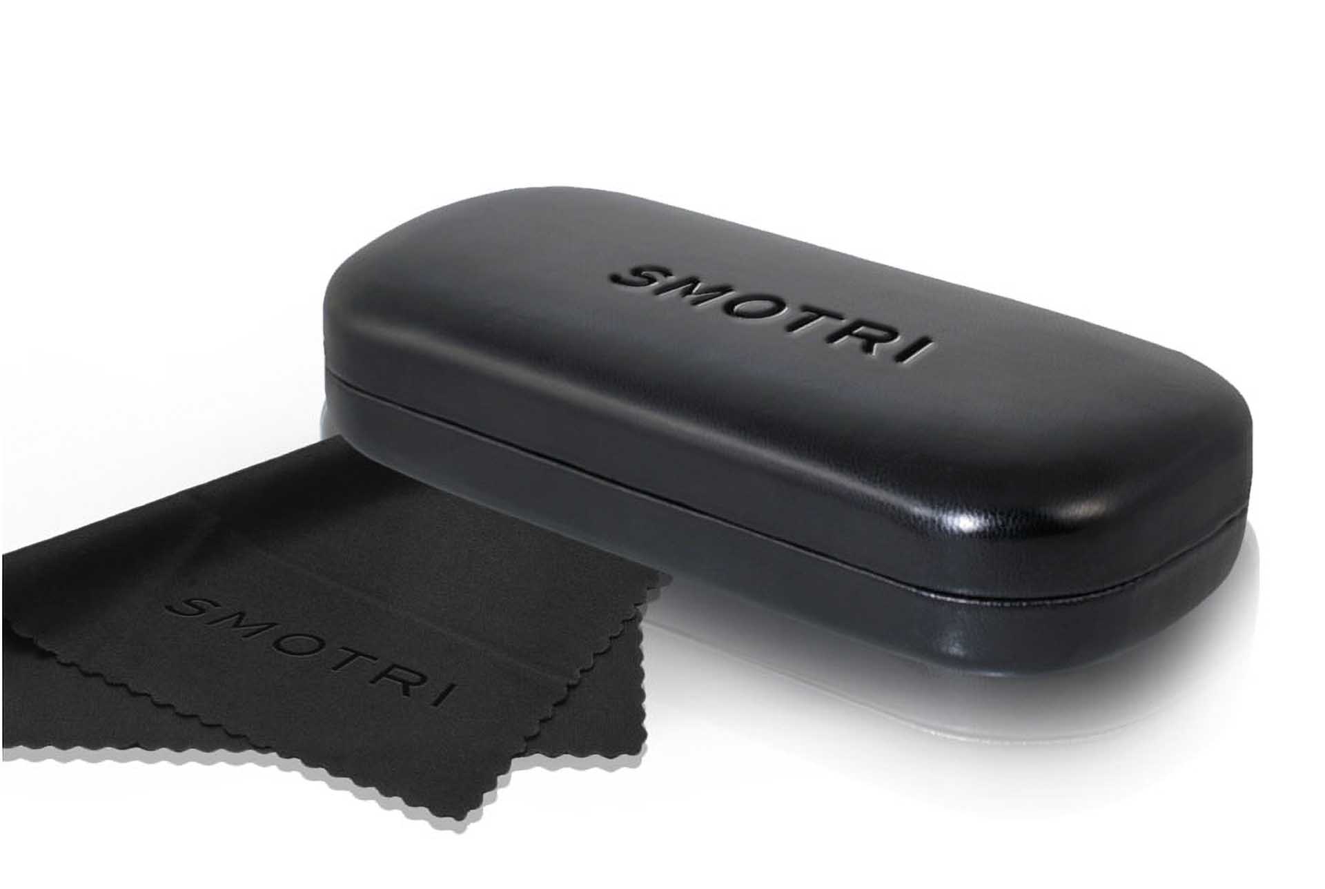
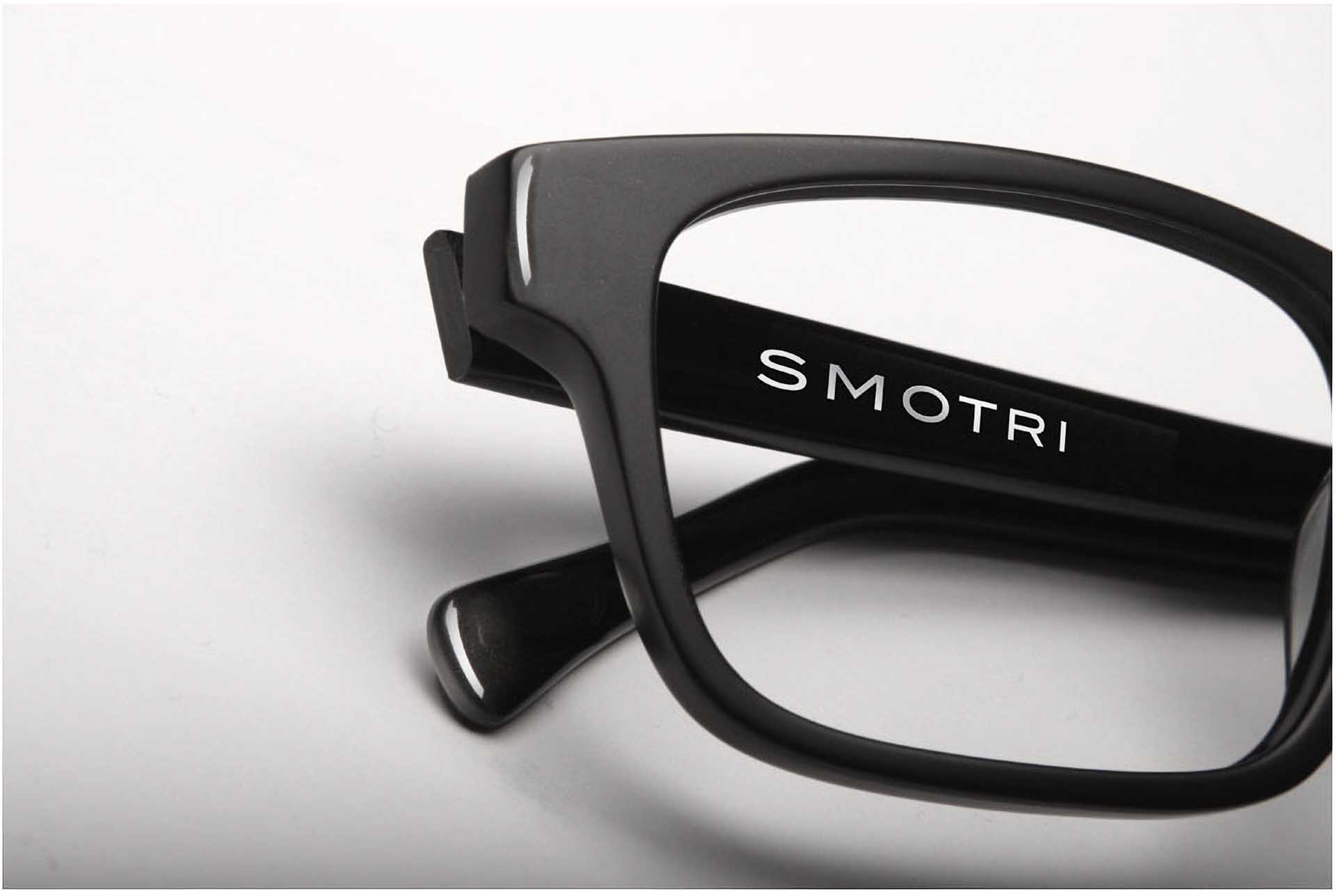
Futures, Brand Strategy, Design Strategy, Communication Strategy, Naming & Storytelling, Logotype Design, Visual Identity, Packaging Design, Shape Design, Digital Design, Web Design, Retail Design.